Semester Review
I have to say, of every art class I have ever taken, I think I did my best in this class. Whether it's doodling during class or actually taking the time to draw something bigger, I am always flexing my artistic muscle, and I'd say it's definitely paid off. I've seen a lot of improvement over the years, and I am so proud of myself. I'm also proud of everybody in my class, they are all so talented and have so much potential. I learned so many new things in this class and I've really built up my confidence in drawing. I think something I enjoyed the most was using colored pencils because I like looking really hard for the colors you wouldn't normally see. I also really liked learning how to draw faces since I doodle people all the time. I thought we might learn to draw bodies, but that's okay. I can always learn and practice in my free time. I'm incredibly thankful for Ms. Rossi and for deciding to take this class!
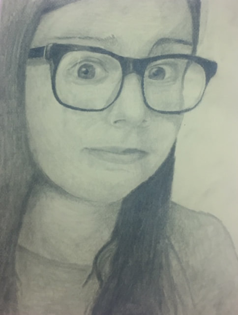
Self portrait
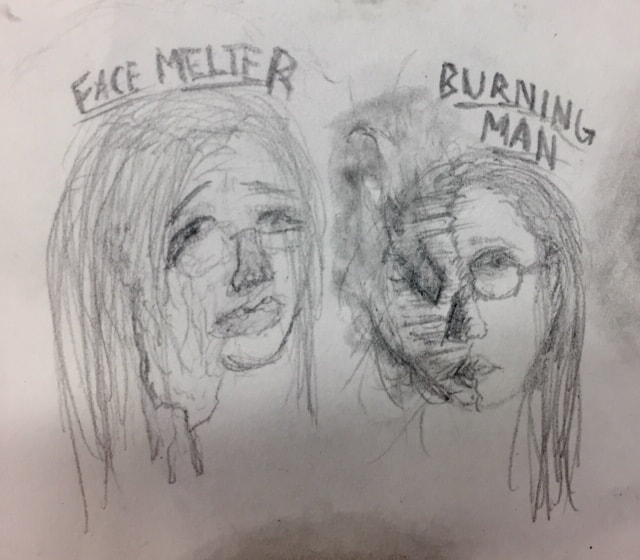
The first image shows my original ideas for my self portrait. My first idea was to just have one side of my face melting off, and my second idea was to make it look like half of my face was a burning, wooden skeleton, a reference to the Burning Man festival. I had wanted to do Burning Man, but I realized I had no idea how I would go about drawing the wooden face. Finally, my third idea was just to draw myself with an expressive face. I ended up going with the third idea.
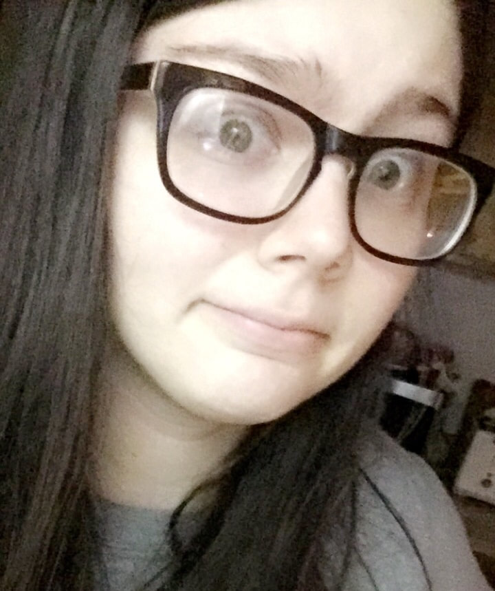
Reference Photo
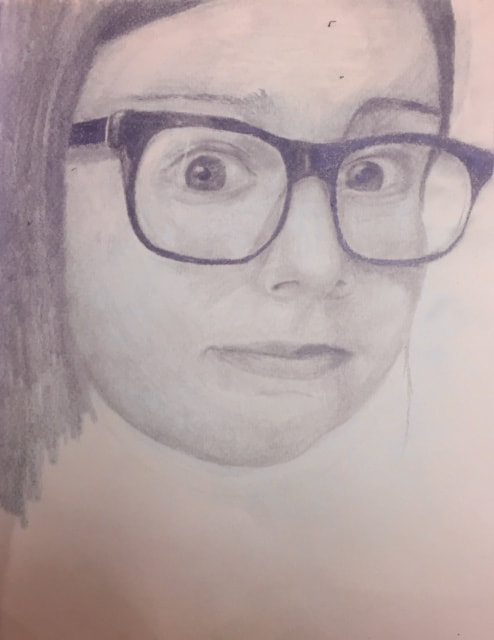
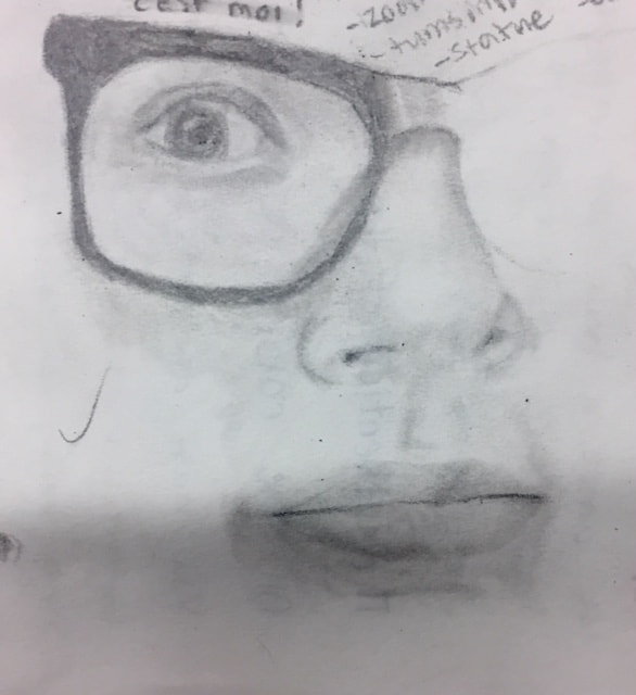
1. I started my drawing with the eye, nose, and the outline of my glasses. From there I continued by adding my other eye, coloring in my glasses, and defining the shape of my face. I finished off with the lips, hair, and adding some more shading.
2. Looking at the photo I took, I looked for how things gradually became lighter or darker, and I blended carefully trying to make the values as accurate to the photo as possible.
3. I think I could have made some things darker and some things lighter in my portrait. You can definitely see a range, but it could have been more intense.
4. I think the craftsmanship of my portrait is pretty good. Everything looks mostly proportional. I do think there are some parts that look a bit messy, but overall I'd say it's very well done. I showed it to my mom and she absolutely loved it and showed it to some other family members. It was a little embarrassing, but I am proud of myself.
5. The only way I can describe how I captured my look was just by really looking closely at the shapes of the features on my face. The eyes are clearly what creates the expression, since they're wide open.
6. I basically just used my pencil to "measure" where things were on my face. I also looked at how things lined up in my photo and tried to recreate that in my drawing.
7. It's important to learn how to draw individual facial features so you can keep practicing those little things and eventually put them all together into one drawing. Learning to draw each individual feature was actually really helpful, for me at least.
8. Of this whole unit, learning about proportions and drawing the different parts of the face was most beneficial. It's definitely important to know how to draw faces that are proportionally accurate, or else it might not look realistic.
9. I didn't face too much of a challenge while doing this (other than lacking motivation), but I did have a hard time drawing my lips. After redrawing them a few times I just kind of shrugged it off and said, "Good enough." They don't look exactly like my lips, but they're not terrible.
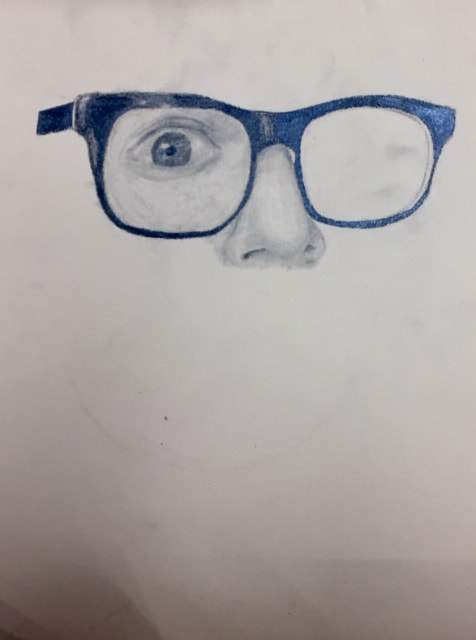
Facial Features
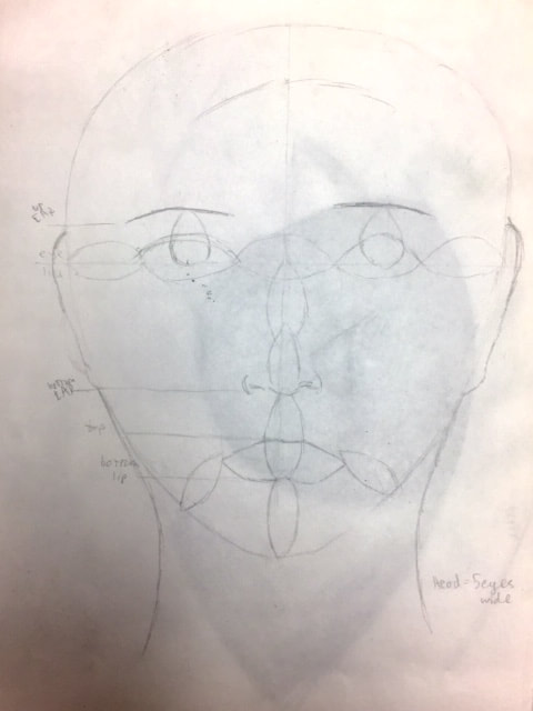
When we first started learning about how to draw faces, we learned about the proportions, using eyes as a measuring tool. For example, the distance from the bottom of the nose to the bottom of the bottom lip is one eye. I definitely think this was important to learn, because proportions are always something I struggle with.
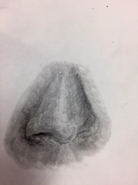
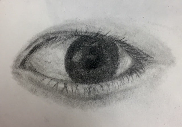
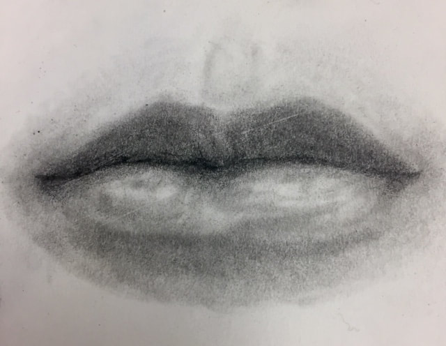
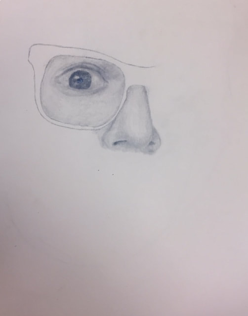
To prepare for our self-portraits, we had to practice drawing individual facial features. First we watched video tutorials to get an idea of what techniques to use, and then we took photos of ourselves to reference from. I'm surprisingly very proud of myself. Usually if I'm just doodling or something I'll draw faces, but I've never tried going into great detail by looking at a photograph. We started drawing our noses, and while I am proud of it, I do think the blending looks a bit strange. I think it looked better before I blended it. After that we did eyes, and I am actually completely dumbfounded by mine. I'm sure it's not perfect, but I've spent a lot of time just staring at it because I'm so proud of it. Eyes are the thing I doodle the most, and having these new techniques up my sleeve makes me so incredibly happy. We then drew our lips, which are actually a lot harder to draw than I thought, but I really like the way mine came out.
Opacity
Reference Photo
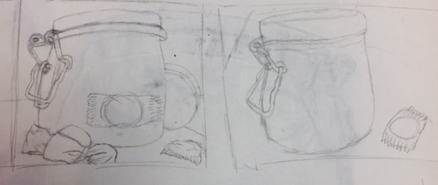
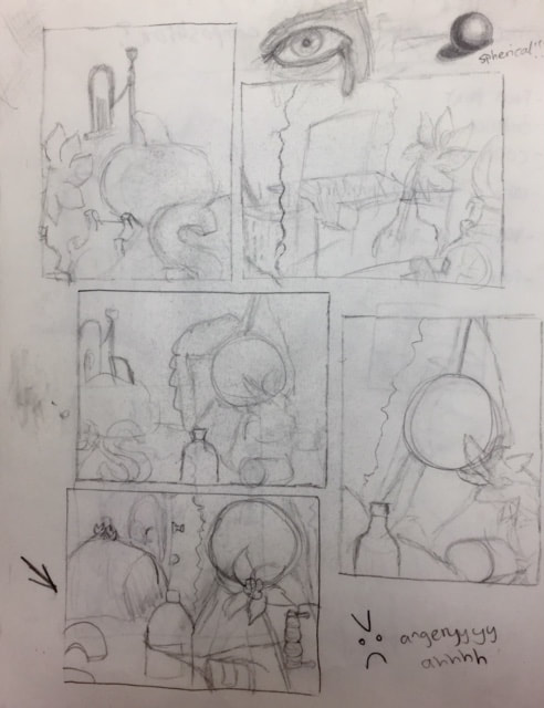
Compositional Sketches
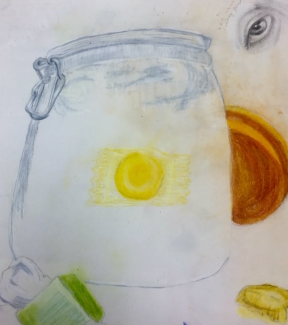
Color Sketch
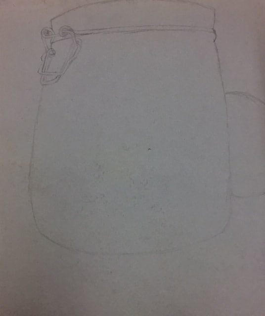
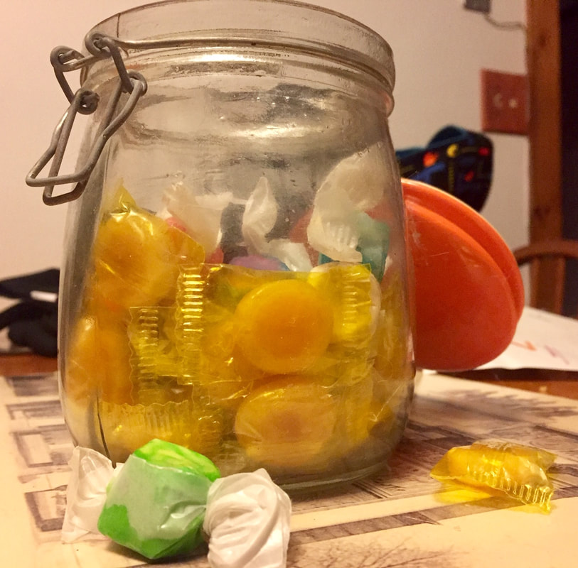
Final
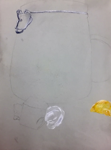
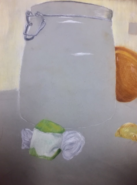
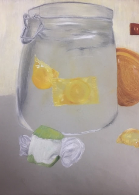
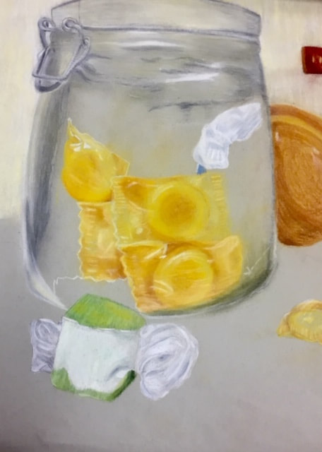
1. I think my drawing looks pretty well-crafted, even though it isn't completely finished. The lines and colors look neat and soft. Some of the highlights could maybe have been improved, but overall I think it's neat.
2. My choice of colors purely came from what I was able to see in my photograph. It's mostly very warm colors in my drawing, but the saltwater taffy stands out a lot more with cool colors. I also had to use colors from the background in the jar to indicate that the jar is transparent.
3. The warm, yellow butterscotch candies are contrasted against the cool taffy colors. There's also contrast between the candies and the colors of the jar.
4. I tried my best to create the little grooves in the candy wrappers by using highlights, but I think I could have improved this. I really like the way most of my highlights and shadows turned out, though, the wrappers look very realistic and there's depth showing that there's something inside of the wrappers. I also had to use highlights and shadows to make sure the candies didn't all blend together into one big mass.
5. The background isn't very detailed, since it's just my kitchen wall, but the color is light, yet warm. The subject stands out against it, but also works with it nicely.
6. I used pastels for my drawing. I would have preferred colored pencils, but I felt the softness and the way the pastels blended would make drawing glass easier. It's definitely important to understand how to use pastels and how they blend, because if you overdo it it can just pick up all of the color and make it look duller. As for using colored pencils, it's important to understand that you have to use lots of layers.
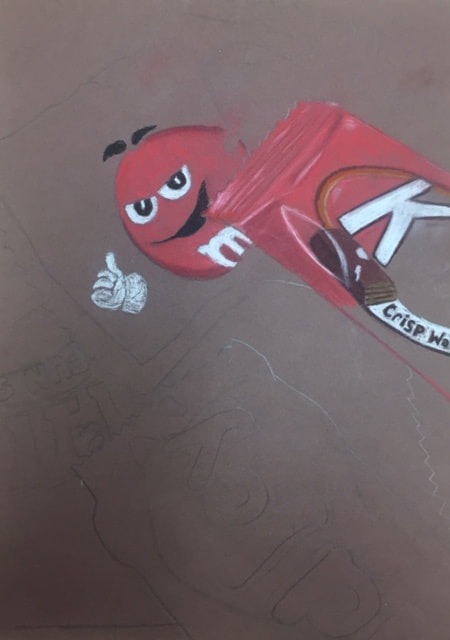
Candy
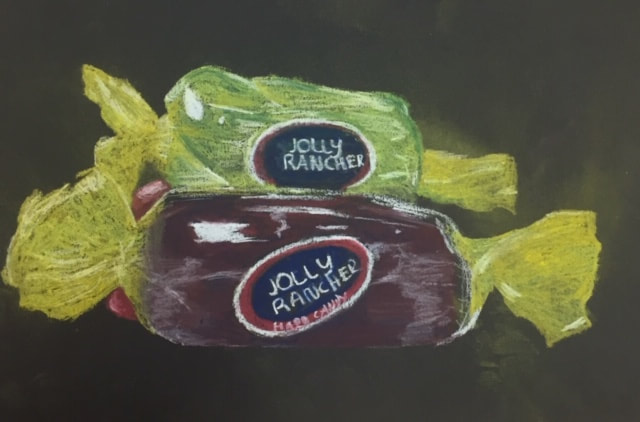
Here we have a drawing I did of some Jolly Ranchers. I can't remember, but I think this was to practice drawing transparencies. I don't like how the green one turned out, but the purple one looks alright. The twisty, yellow part of the wrapper also looks kind of weird, possibly because it's yellow on black paper, but I probably could have made it look better.
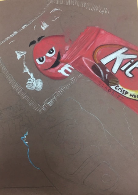
In-Progress Photos
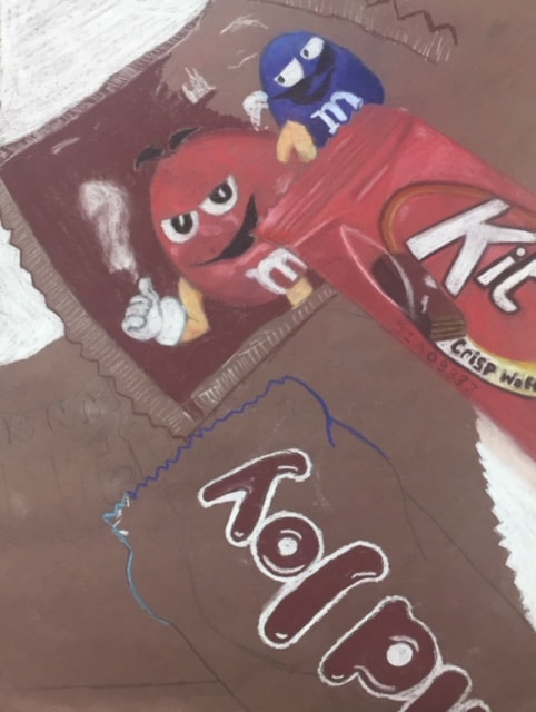
A while ago, we had an arrangement of various sweets set in front of us and we were told to draw them using pastels. Unfortunately, I didn't have enough time to finish it before we had to move on, but at least I got some more practice with pastels. I also got more practice drawing folds and working with highlights. I'm happy with how the Kit Kat came out, but everything else looks very flat at the moment.
Pastel Apples
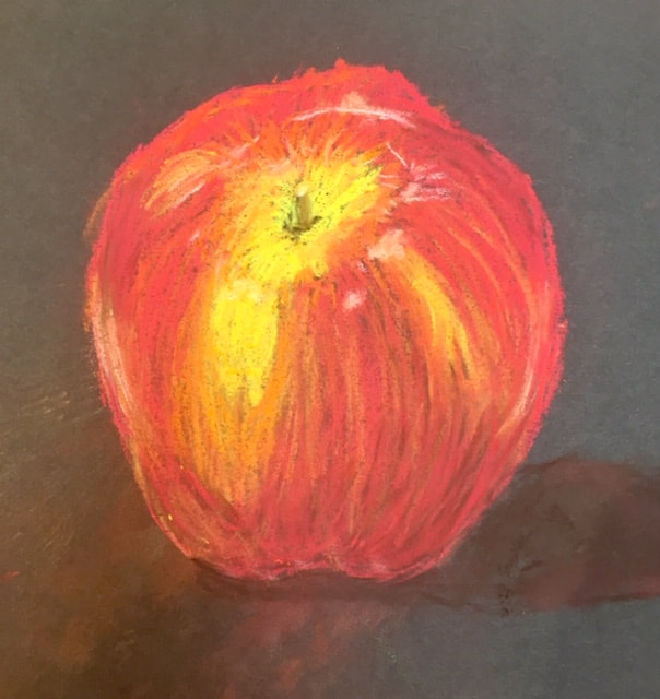
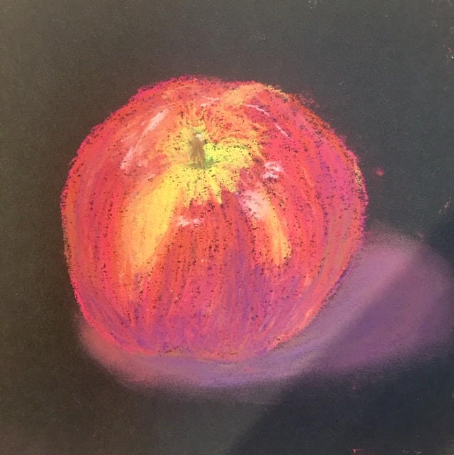
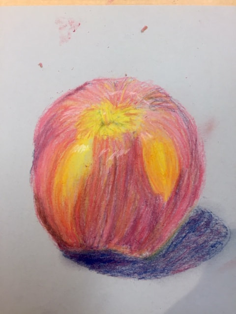
This week we started using pastels. They're certainly not my favorite medium to use, but I did actually enjoy drawing the apples. I liked mixing all sorts of colors together. For the first apple we used softer, chalkier pastels. I really liked the way this one looked after I finished. Next we used firmer, Prismacolor pastels, and I had more colors to work with, such as the purple which I used for the darks and shadows. I really like the way the colors look on this one, but I think the shape of the apple looks a bit strange. Lastly, we used pastel pencils, which I struggled a lot with because they refused to sharpen and I had a limited number of colors. I think I appreciate pastels a lot more after doing this.
Look At That View
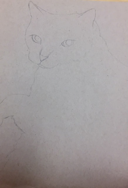
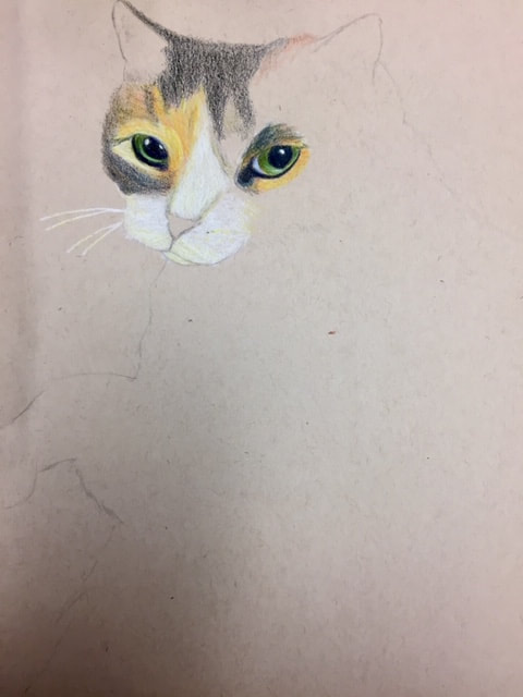
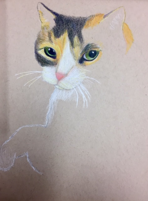
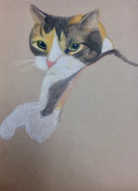
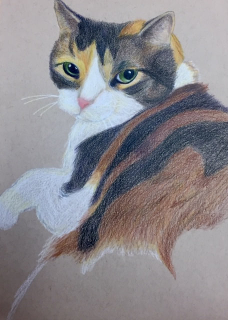
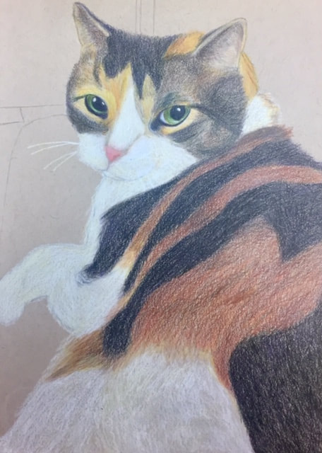
In-Progress Pictures
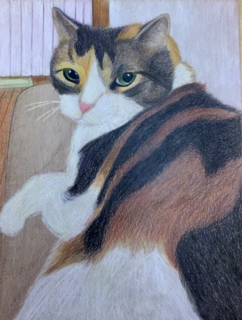
1. The point of view in my drawing is supposed to show how her body gets bigger as it's closer to me. It also shows the effects of perspective in the background. I think I should have tried taking better pictures from more interesting perspectives.
2. It's really important to understand how to draw in perspective because it's integral to making things look realistic. We see things in certain ways depending on how we're looking at it, and if you want the drawing to look like something you would see with your own eyes, you have to know how to use perspective.
3. Doing the fruit drawing, I learned more about using colors that you might not see unless you look closely at the subject. I used that to my advantage in this drawing, using yellows and purples mixed in with the white.
4. I didn't really have a specific technique in mind while I was doing this, I was sort of just going for it because I find things always end up looking better that way. At first I was trying to use singular strokes of color to create texture, but I didn't like the effect that was giving, so I started coloring in small circular motions instead.
5. Depth is apparently something I struggle a lot with. I suppose you can tell that there's a difference in the foreground and background, but I feel that I should have made it more apparent.
6. I actually really enjoyed this project. I liked seeing the progress I made every day and I think it looks nice. It also means a lot to me, since it's my cat. I do think some of the proportions could be improved. It also sort of bothers me how you can see the paper in the fur, and I think the texture of the fur on the body could be a lot better. I liked using colored pencils though, they're a really nice way to work with color.
7. I guess I would want to learn more about how to create depth and also how to bring out more of a fur-like texture. I could probably have been more prepared, but overall I think I did well.
Perspective Practice
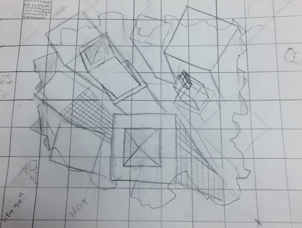

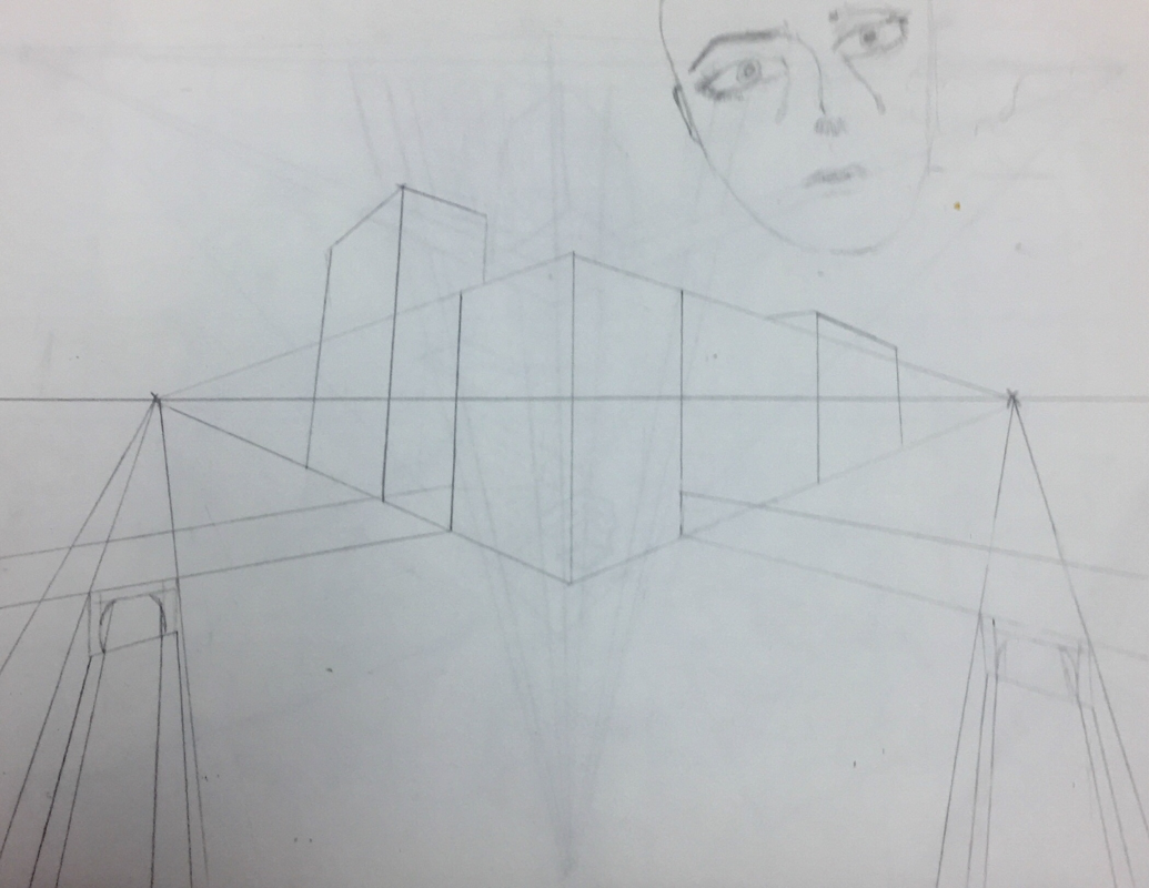
Last week we watched a few videos about drawing in perspective. I’ve learned about it before, so I’m familiar with how it works and I am also familiar with how much I hate perspective. It’s an incredible thing, yes, and the techniques can be really helpful, but it’s the most boring thing, in my opinion. I didn’t put much detail into these drawings because I just wanted to move onto the next one, and I understood how to do it. The different perspectives in my drawings are: 1-point perspective, 2-point, 3-point, and then the last one was drawing a city in 3D that looked like it was popping out of the page. The 3-dimensional one was harder than the guy in the video made it look. Basically, this wasn’t a fun time, and I miss colored pencils, but I definitely did learn something so that’s good I guess.
Fruit
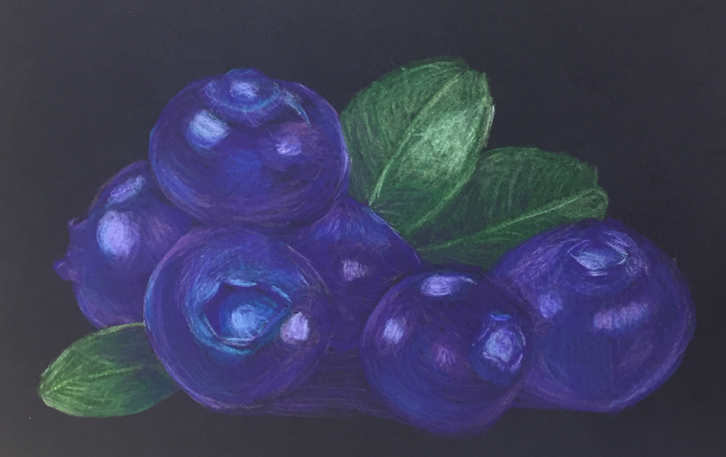
Here I have a drawing that I did in colored pencil, and I must say I absolutely adore working with Prismacolors. Some may disagree, but I think this is the best thing I’ve ever done and I am so unbelievably proud of my blueberries. It’s just unfortunate that we’ve spent such little time with colored pencils. Basically the assignment was to pick a photo of a fruit and draw it, looking deeper into what sorts of hues make up the fruit. Sure, a blueberry is blue but it is also purple, pink, white. I definitely think this colored pencil drawing of fruit is an improvement from the apples I drew in Art 2. I really enjoyed this assignment.
White Ribbon
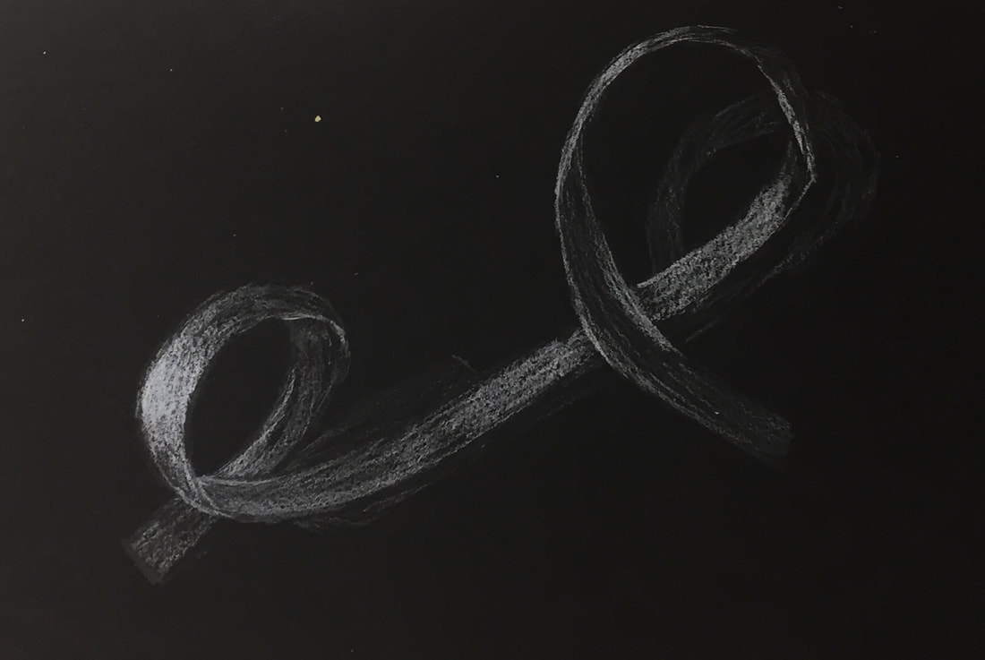
We started off learning about colored pencils by using white on black paper. It's a bit confusing using white colored pencil on black because it's like you're working backwards. Instead of using the pencil to create shadow, you're creating highlights. We took a strip of white paper and curled it around, taping it to the paper and then drawing what we saw. Something I learned from this is that when you're showing where something overlaps, you have to indicate the overlap by adding a highlight. This certainly isn't a perfect ribbon drawing, but I am quite proud of myself.
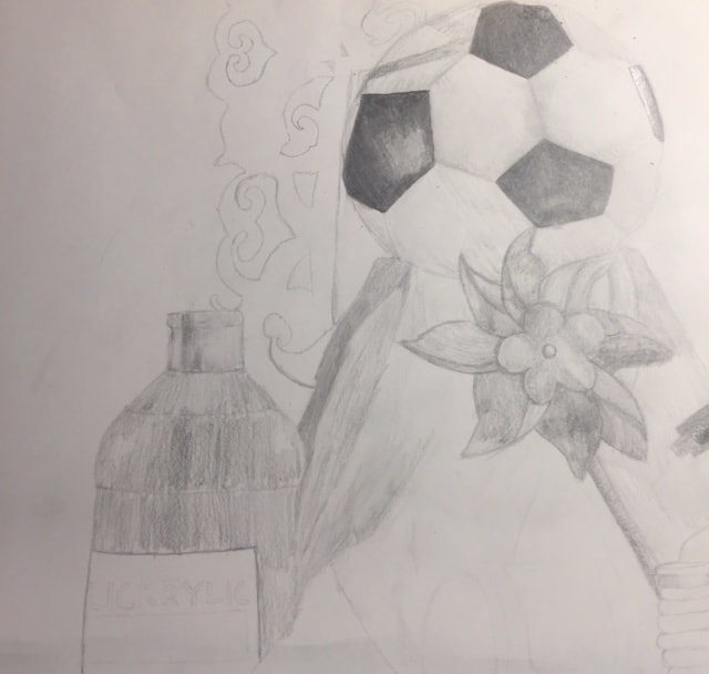
Still Life
Compositional Sketches
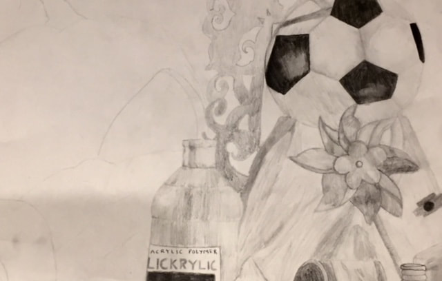
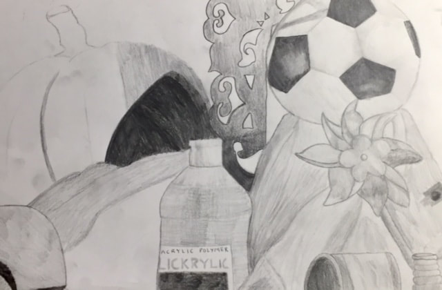
In-progress Pictures
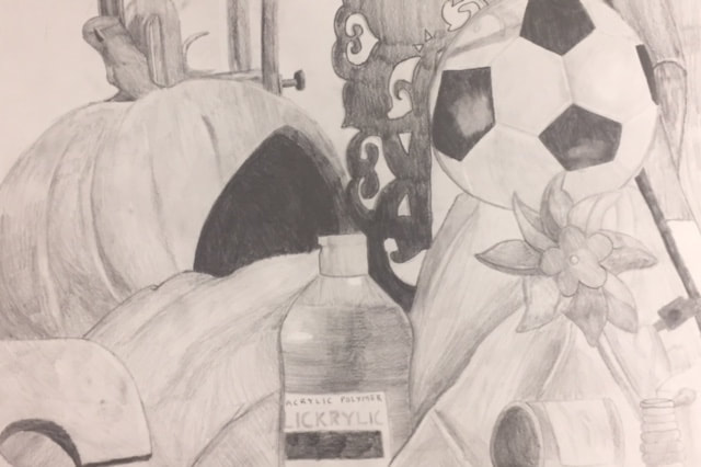
Final
1. I would say that the craftsmanship of my piece could definitely be improved. I think if I used a wider range of values it would have blended a lot better, and it would have created more depth. I think it looks very flat, so the space needs to be more defined.
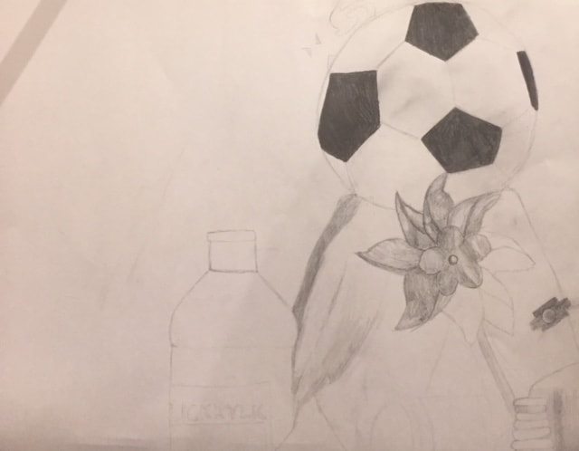
2. I got a lot of comments saying the shading on the soccer ball looks really good, so I guess I did a good job using values on that. Overall I think I could do better. I didn't use as many values as I should have, and that makes my piece look very flat. Value is important to create depth and realism, because shadows and highlights and all that is in between is in everything in real life.
3. You can see that there are highlights, indicating light. It's hard to determine where the exact "source" of the light is since there were many lights, but I probably could have tried to define the light better by adding more darks.
4. The compositional sketches were very important because it allowed me to look at the still life from different perspectives. A lot of my sketches had too much empty space in them, but luckily I was able to find something that filled up a majority of the page and make it look somewhat interesting.
5. As I said before, many people liked the soccer ball because of its shading. Personally, I'm most proud of the pumpkin, because I like how neat the edges look.
6. For the most part I think the proportions are pretty good, but some things are smaller than I saw them or not in the exact position.
7. I think my composition looks interesting, however, I maybe could have zoomed in a bit more to eliminate the white space on the left. I got a lot of interesting objects into the frame, providing me with different challenges.
8. I don't think there's really a focal point in this piece. My eye is drawn to the pumpkin because of the darkness, but I wouldn't call that a focal point. I probably should have considered that.
9. I feel that I managed my time well during this project. I was able to get everything done on time, but that could mean that I didn't take as much time and care as I should have.
10. The biggest challenge had to be trying to make it look like there was depth. I tried making things darker, but it still ended up looking flat. It was also challenging for me to make the blending between values look seamless and it was very tempting to just smudge it, but I resisted.
11. I learned more about drawing fabric, even if I haven't mastered it yet. It's possibly one of the hardest things you can draw, in my opinion. It may not be completely realistic, but I think I did an okay job of it. I also learned that value is extremely important and that it's important to use a wide range of values.
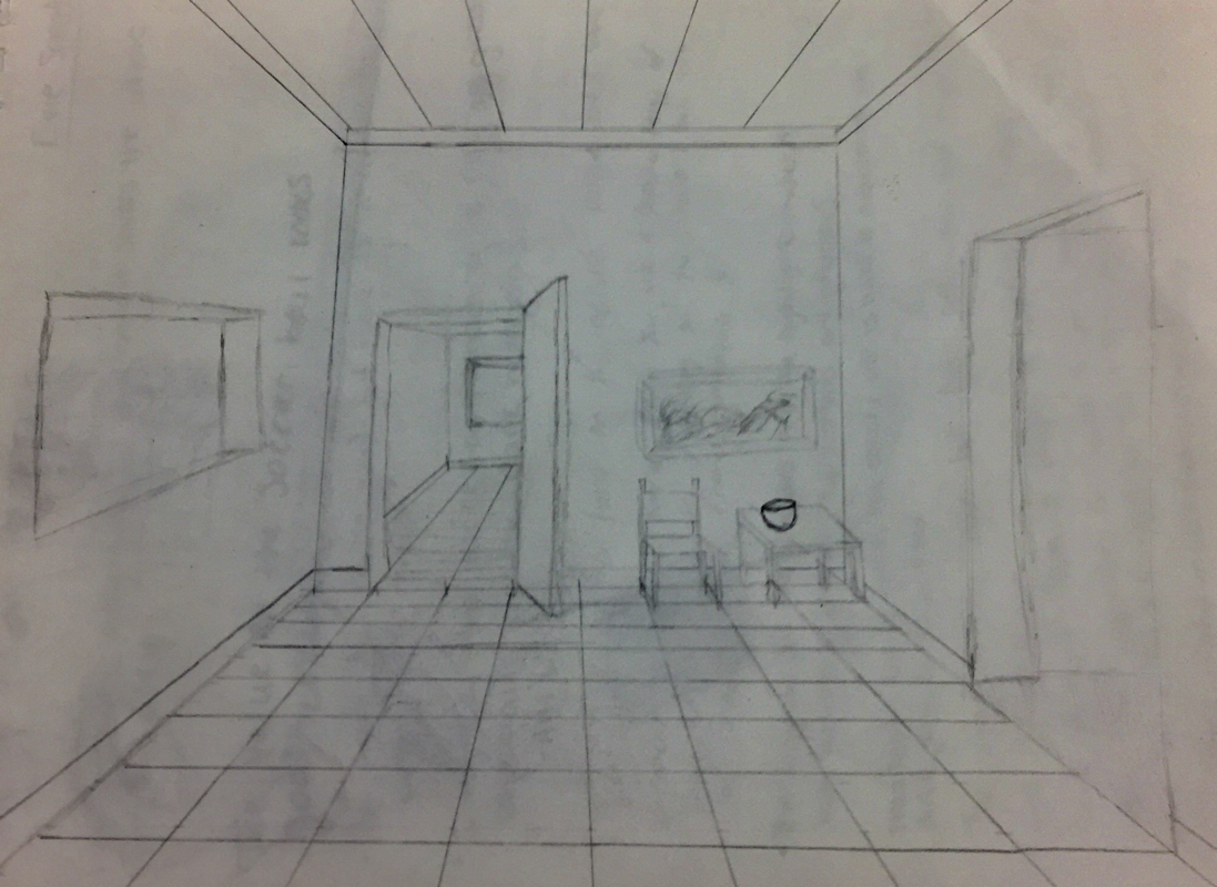
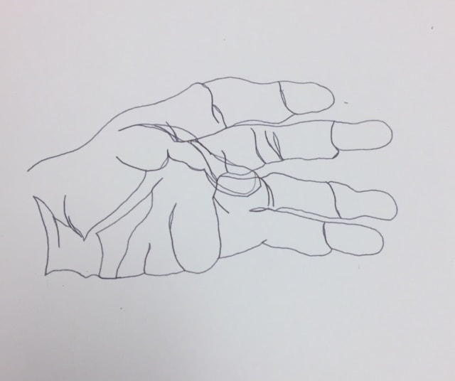
Contour Room Drawing
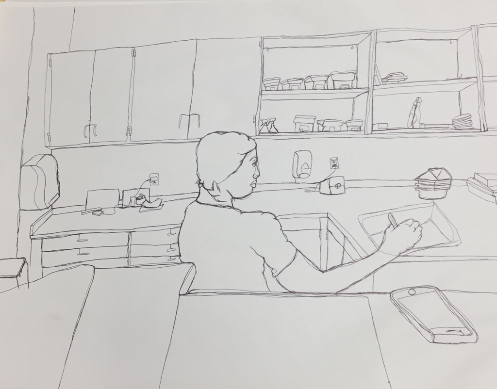
1. It’s evident that I used one fluid line throughout my piece based on the fact that you can see I had to go in and out to draw certain parts on the insides of the objects in the room.
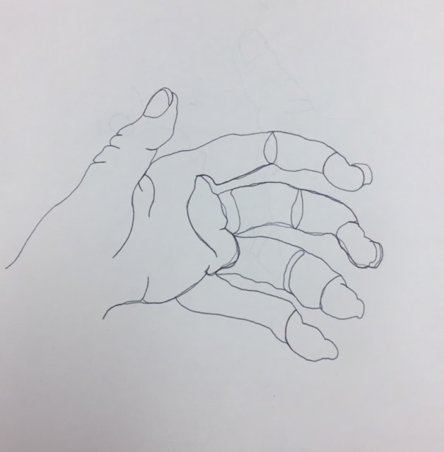
2. We practiced doing contour drawings when we drew our hands. We then did more complex drawings, such as the shoe and the backpack. I got lots of practice by doing these drawings, so they helped me to understand what techniques would make my drawings better. For example, I learned to draw what I see in one area so I don’t have to go back and forth.
3. In a contour line drawing, you draw all the lines you see, including the ones within the object, whereas with an outline drawing you just draw the lines that make up the object’s shape.
4. My interpretation of the line allowed me to see the little geometric details and the more organic details, making the room as realistic as I possibly could.
5. I didn’t even know what a contour drawing was before we learned about them in class. I learned the techniques that go along with creating a contour drawing, and I also learned that I have a long way to go until I master contour drawings. However, I also realized how much I don’t enjoy doing contour drawings. Your hand hurts after doing it for a while. If I were to do this again, I would try to be more proportionate, also drawing the person was difficult since she moved while I was drawing her, so I’d probably try to avoid drawing a person.
Paper Bag, Fabric, And Shapes

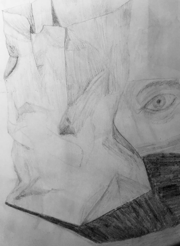
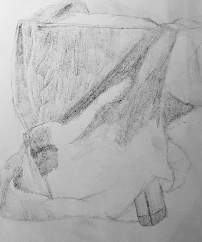
We've been focusing a lot on value the past couple of weeks. The first image is of my attempt at drawing 3-dimensional shapes with value and shadow. I found that to be relatively easy, but something I'd want to improve on is making the transitions look smoother. The next picture is of a paper bag we drew in order to practice the skill of drawing folds and crinkles. Drawing folds is one of the hardest things I've ever had to do. It's like I can see in my head how it's supposed to be, but actually putting it on the paper is very difficult and something I definitely need practice with (also please ignore the random eye I drew, I felt like doodling). Finally, the last image is of draping fabric where we got even more practice drawing folds and more practice with transitioning values. I do hope to get better at drawing fabrics and such.
Contour Drawings
This week was all about making contour drawings. We learned what a contour line was and how to properly execute a contour line drawing.

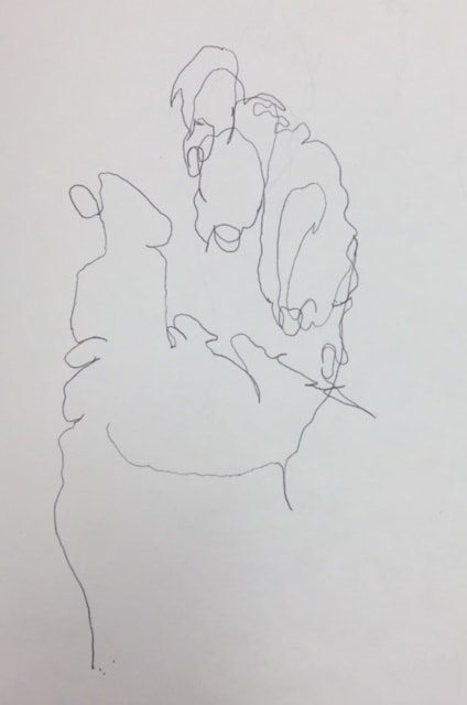
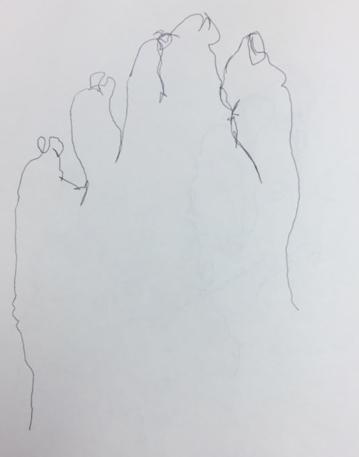
First, we did blind contour drawing. In this practice we had to turn ourselves away from the paper and not take the pen off the paper while trying to draw every line in our hands. Naturally, it doesn't look like much, but you can sort of see that it's like a hand.
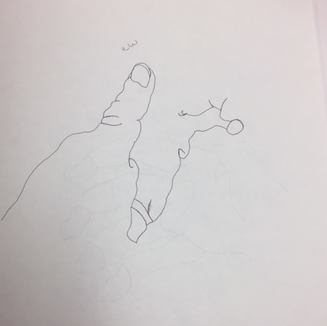
Secondly, we did contour drawings where we could actually look at the paper. The first time I did it was a disaster because about halfway through I didn't realize I wasn't even looking at the paper. The next ones look more like hands, but they're kinda messy.
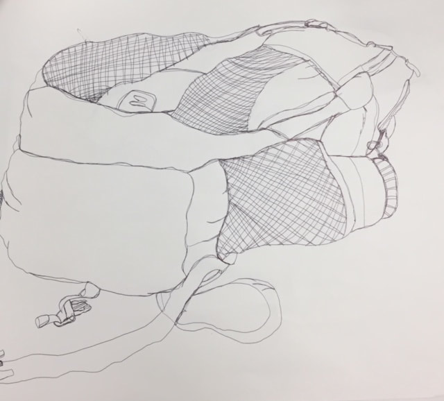
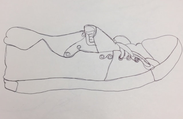
Lastly, we drew a shoe and then a backpack. I think my shoe came out nicely, even if it wasn't as good as everyone else's. I'm still proud of it. Drawing the backpack was a lot of work, and my hand was starting to cramp. It was really hard getting it to look exactly like I saw it. I also noticed throughout this whole thing that I constantly got distracted and lost my place. This was challenging for me, but hopefully I'll get better.
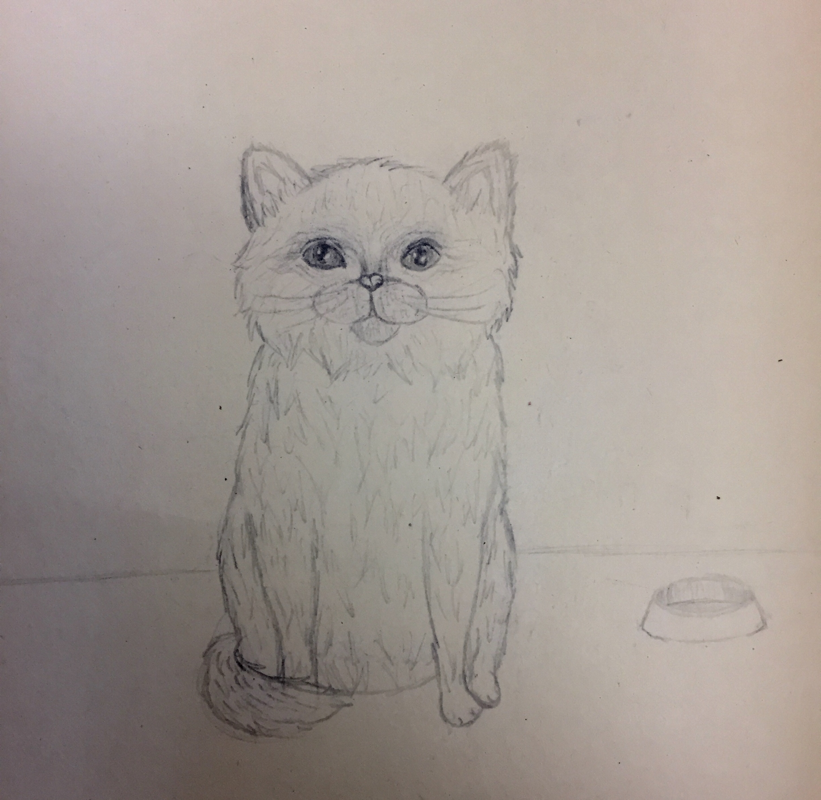
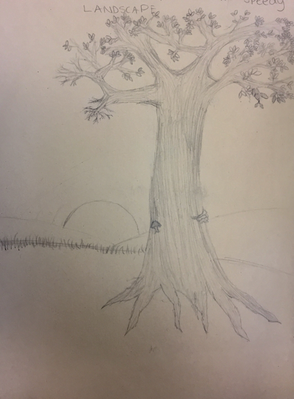
Four Drawings
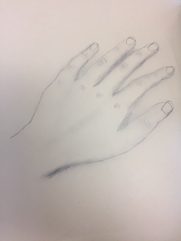
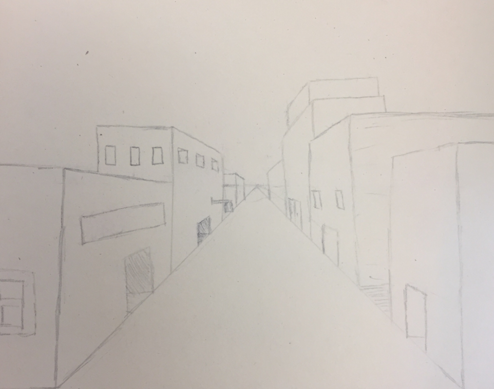
For the first couple days of school we worked on the Self-Assesment. I’ve done this before when I was in Art 2, but I definitely think I’ve improved in some areas. I took more time to complete it whereas in Art 2 I sort of rushed through it. The first drawing was of a Tree in a Landscape, so I basically started with an outline and filled in some details. I also actually took the time to draw our tiny branches and more leaves. The second drawing was of an Animal, so I decided to draw a cat, because I have more experience drawing those than any other animal, and cats are just amazing in general. I don’t think the face looks very good, so I’d probably redo that, but other than that I think it’s okay. The next drawing is of a Street Scene using one-point perspective. The first time I did this in Art 2 I had forgotten how to draw in one-point perspective, so it wasn’t done very well, but I’ve learned!!! I could have definitely added more detail to this one. The last drawing was of a Hand. More specifically, my hand. I looked at my hand and drew what I saw and then added the lines and shading. It’s not very proportional. Proportions are something I really struggle with, so hopefully that’s something I can improve on.
