Clay FOOD
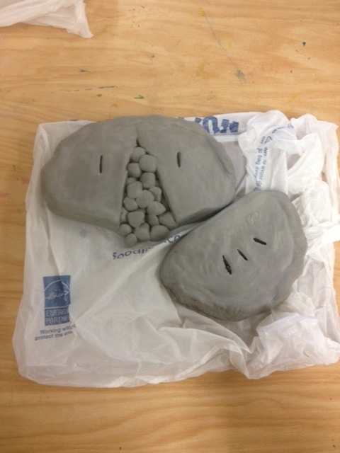
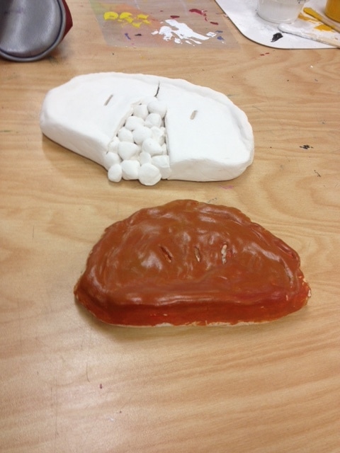
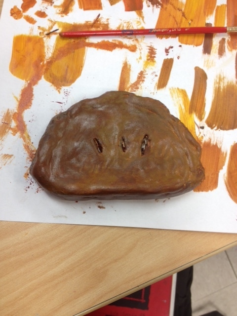
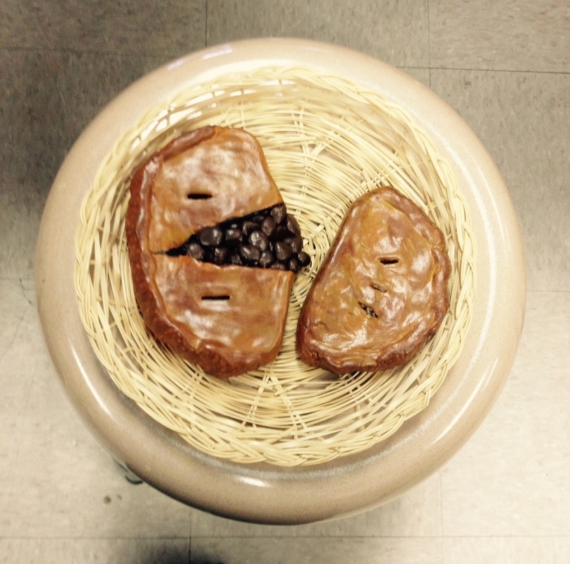
My sculpture is of a Cornish Pasty, a delicious pastry filled with meat and sometimes vegetables. Unfortunately, they don't sell them in America, but they remind me of the past when I used to live in England, so that's why I decided to sculpt them. For the most part, my sculpture is neat and I tried to put as much detail in as possible, but of course there are some parts that could be improved. The most difficult part of the project was mixing the perfect colors together. At first I painted them too dark and I had to keep adding more and more yellow to lighten it up. However, I am happy with the way the color turned out. The colors I decided to use was a tan with some darker browns to simulate burned dough and a dark brown for the meat. I think the colors I used work very well together and, in my opinion, it really does look like there are some parts of the dough that got "cooked" more. I'm not sure what would make it look interesting, but there are definitely some angles that look better than others. Some parts of the sculpture aren't painted perfectly because I couldn't get paint into the little divots. When you're working with clay instead of 2D, you have to be conscious of how it looks from all perspectives. You don't want someone to look at it from a bad angle and decide that your piece looks like a disaster, so you have to make sure it looks good from all angles. I tried creating texture on the crust to make it more bumpy. Real crust is imperfect, so I tried to make it look this way but I still wanted it to look good. I think my clay does look pretty realistic, but of course it isn't perfect. I think the thing that makes it most unrealistic is how shiny it is. I think what really made it look realistic was the color. If I were to do my project differently, I would try to find a more efficient way to cover EVERY white spot visible on the piece.
Jacob Lawrence Painting
The artist I chose to imitate was Jacob Lawrence. Some of the main things I used to recreate his style were bright colors, dark colors, and I used his method of starting with the dark colors and moving on to lighter ones. The majority of my painting is pretty neat, but in the smaller parts it looks a bit messy. I tried to make it as smooth-edged as possible, but I feel that I don't have much control with a paintbrush. The most difficult part of this project was the constant mixing of colors, which probably sounds ridiculous, but it's really tedious for me. Jacob Lawrence is known for using vibrant colors contrasted with blacks and browns. I represented that in my painting by using bright blues and yellow and a large part of it is black and brown. I tried representing his style by being very simplistic. Not a lot of details are in his paintings, it's mainly just colorful shapes. I think if Jacob Lawrence were to see my painting he would probably be grateful that I chose his art style and he'd give me a pat on the head and say "Good try, Evie. Good try." If I were to do this project again, I would try to be neater about it. For some reason I didn't think to ask for a smaller brush, so I had a hard time getting into small spaces, so next time I need to work on that.
Color Wheel
I FINALLY FINISHED IT!!!
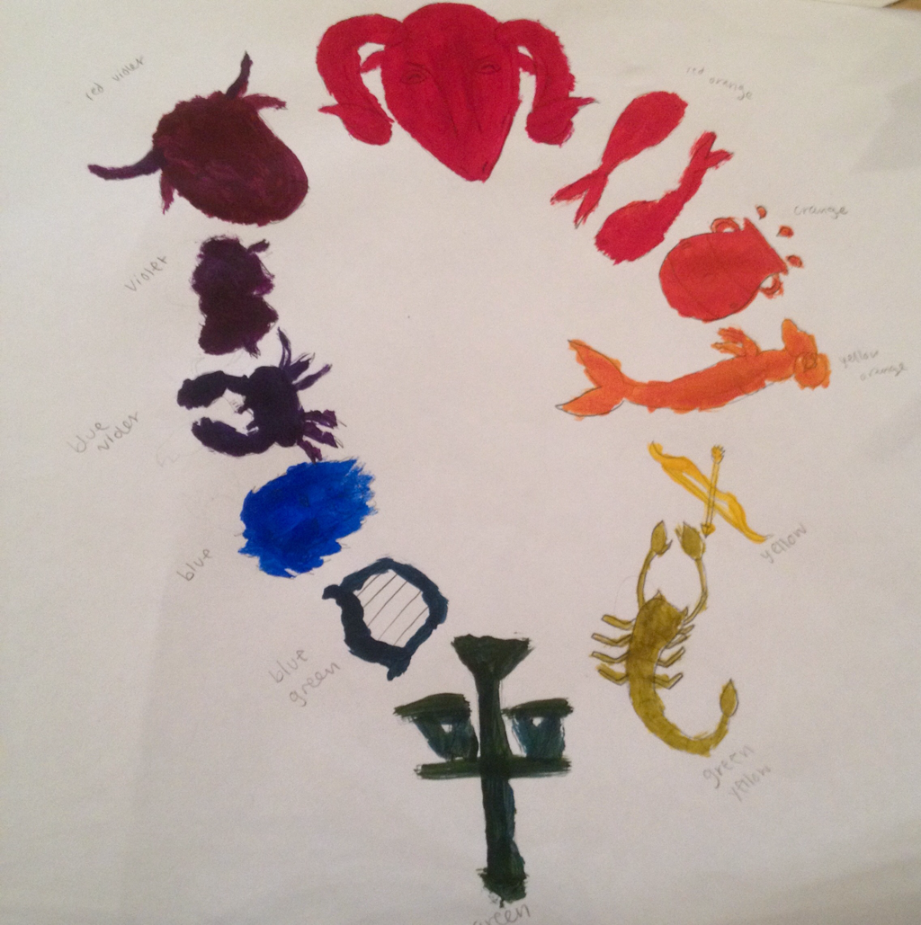
The project was to create a "creative color wheel." I decided to use the zodiac signs. You can't really tell what some of the objects are, unfortunately. This project taught me to mix colors.
The project was to create a "creative color wheel." I decided to use the zodiac signs. You can't really tell what some of the objects are, unfortunately. This project taught me to mix colors.
Painting again...

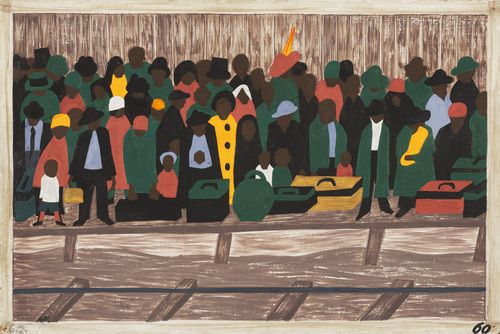
In this project, we were given a small piece of someone else's painting, and we had to recreate it exactly. On the left is the original picture and on the right is my attempt to copy it. The hardest thing about this for me was making it look neat and straight edged. Staying in the lines is obviously something I struggle with. I don't know if it's the paintbrushes I'm using or just me, but I have a really hard time with that. Overall I think what I did looks okay. The proportions are a bit off, but you can still tell it's copied from the picture.
Paint
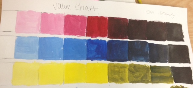
Here we have a paint value chart using the three primary colors, red, blue, and yellow. In the middle of the chart is the original color. To the left of the color, it gets lighter and lighter because I added more and more white each time. This is called "Tinting." To the right, the color gets darker after adding black, and this is called "Shading."
Jacob Lawrence Essay
Artistic expression has been around for centuries, conveying the artist's deepest thoughts or telling stories from history. Jacob Lawrence, a talented painter from New Jersey, used his artistic ability to create visually stunning illustrations of African-American life and history. He began doing art when he was in foster care, usually coloring with crayons and gaining support from his teachers. After he dropped out of high school, he continued to practice art at the Harlem Art Workshop. During the time of the second world war, Jacob was drafted into the U.S. Coast Guard. Out of this experience came his War series, a visual documentation of what he went through during this time.
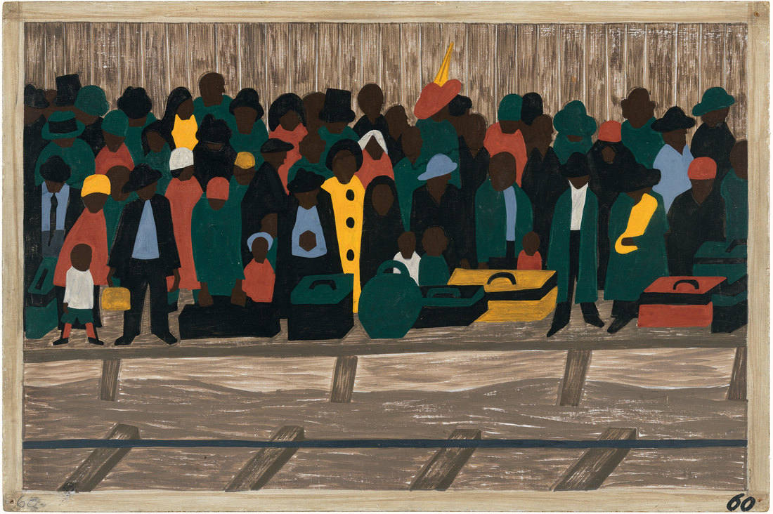
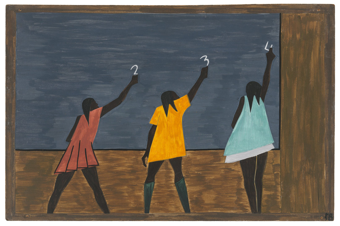
Lawrence was known for using a style called dynamic cubism, incorporating a variety of shapes and colors into his work. Jacob painted using one color at a time, starting with darker colors, such as blacks and browns, and moving onto more vibrant colors as he went along. His famous Migration series, depicting the migration of African-Americans from the South to the North, was painted on cardboard.
Jacob Lawrence painted many incredible pieces, two of them being “And the Migrants Kept Coming” and “In the North the Negro Had Better Educational Facilities,” both created between 1940 and 1941. The former has a beautiful contrast between the dark browns and the bright yellows and pinks of the migrant's clothes. This piece shows the mass amounts of people lined up on the platform of a train station, all ready to begin a new life. The latter also has that same dark to light contrast and this piece shows three students reaching to draw on a chalkboard, showing how kids were given better chances at an education up North.
To conclude, Jacob Lawrence was one of the many great artists who worked to shape this world and tell stories through his paintings.
Bibliography
https://en.wikipedia.org/wiki/Jacob_Lawrence#Life
https://whitney.org/www/jacoblawrence/art/painting_method.html
https://en.wikipedia.org/wiki/Jacob_Lawrence#Life
https://whitney.org/www/jacoblawrence/art/painting_method.html
Prismacolor Final
I think my piece is relatively well executed because it definitely looks like my cat, but it's more cartoony than I had hoped for. That seems to be something common with my more realistic drawings. My drawing is kind of flat looking in some areas, but around the bridge of the nose I tried using a light brown to darken that side. I think it would look better with more shading. I represented O'Keeffe's art style by taking something from life with a lot of texture and zooming in on it to focus on the parts of the object that most people don't take the time to focus on. I tried using colors that matched the colors of my cat. This included whites, dark oranges, browns, and blacks. I also used a range of greens for the eye and pink for the nose. I didn't want the white fur to just be white, so I added in some cream and a little bit of peach on the bridge of the nose. There is a lot of contrast between the colors of the fur. There's a lot of white and then there is also brown and black, and those colors are on complete opposite ends of the spectrum. I've been told that I did a pretty good job showing the texture of the fur. I did this by using small strokes and I also used darker strokes on the lighter colors so it didn't all look solid. One of the biggest problems I had was layering. Even when I put tons of layers on, it got to the point where it was extremely waxy and I could still see the grain of the paper. I also struggled with adding value, so I think those are some things I could work on to enhance my final.
Pastels
We started learning how to use chalk pastels and pastel pencils. I will admit, I'm not the biggest fan of using pastels. They're just really messy, and I'm always paranoid about making an irreversible mess. I also have a hard time with them because I feel like I don't have as much control with pastels. However, I do like the way they look if you're able to use them correctly and efficiently because they're very soft and they blend nicely.
Colored Pencils
Some of the AP students taught us how to use Prismacolors, which I must say are fantastic. At first I was a little confused, so my spheres didn't turn out very nicely, but if I added more layers of color to them they probably would have ended up a lot nicer. We had to draw even more apples, and I'm really happy with how mine turned out. If I were to improve my apples, I'd probably color with less pressure, because there's kind of a waxy shine on them that looks kind of unappealing, but I still love my apples :)
WAtercolors
We began learning watercolors by practicing the different techniques, such as using salt/saran wrap or dry brushing. Once we did that, we put those techniques into action by practicing drawing basic 3D objects. I chose to do a sphere and a cone. Then, things got a bit more challenging and we had to paint some apples. I think I struggle a lot with adding dark values when I use watercolor, so that's something I definitely need to work on.
Pen & Ink Final
I'm sorry the pictures aren't in order I don't know how to fix it :(
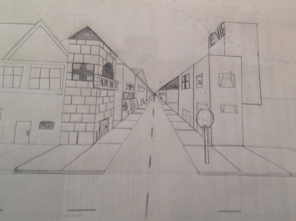
I used one-point perspective in my final project with the buildings going towards that one vanishing point. Originally, I wanted to put the castle in the middle, but upon request, I put it off to the side. Perspective is important because it gives a sense of depth and realism to the structure of your piece. Something that my piece lacks is texture. I wanted to add a wood texture to the frames of the buildings, but I wasn't sure how to go about that. Value is also a very important aspect in this project, which is why we learned the techniques with ink. Adding perspective creates depth, yes, but value really makes the flat paper stick out a lot more. If I could recreate my piece, I would probably organize it differently and use a different perspective. The straight path in the very center sort of takes away the life from the piece, and according to a comment I recieved, having the path somewhere else and the dragon out of the center would make it more dynamic, and I agree with that. I also wasn't impressed with the lack of detail in the buildings, because they look really boxy. I chose to do a simple fairytale kingdom, and the idea was to have the dragon sort of taking over the kingdom. It's very important to understand the pen techniques because if you don't, you could end up making the piece look to flat, like if you don't use enough values and everything is just one value. I've learned that it's important to try many different approaches, because I was so set on having that castle in the middle and I didn't think about how putting it somewhere else could have made it look even better.
I used one-point perspective in my final project with the buildings going towards that one vanishing point. Originally, I wanted to put the castle in the middle, but upon request, I put it off to the side. Perspective is important because it gives a sense of depth and realism to the structure of your piece. Something that my piece lacks is texture. I wanted to add a wood texture to the frames of the buildings, but I wasn't sure how to go about that. Value is also a very important aspect in this project, which is why we learned the techniques with ink. Adding perspective creates depth, yes, but value really makes the flat paper stick out a lot more. If I could recreate my piece, I would probably organize it differently and use a different perspective. The straight path in the very center sort of takes away the life from the piece, and according to a comment I recieved, having the path somewhere else and the dragon out of the center would make it more dynamic, and I agree with that. I also wasn't impressed with the lack of detail in the buildings, because they look really boxy. I chose to do a simple fairytale kingdom, and the idea was to have the dragon sort of taking over the kingdom. It's very important to understand the pen techniques because if you don't, you could end up making the piece look to flat, like if you don't use enough values and everything is just one value. I've learned that it's important to try many different approaches, because I was so set on having that castle in the middle and I didn't think about how putting it somewhere else could have made it look even better.
Pen & Ink Forms
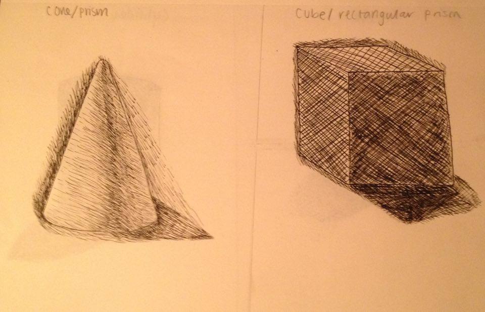
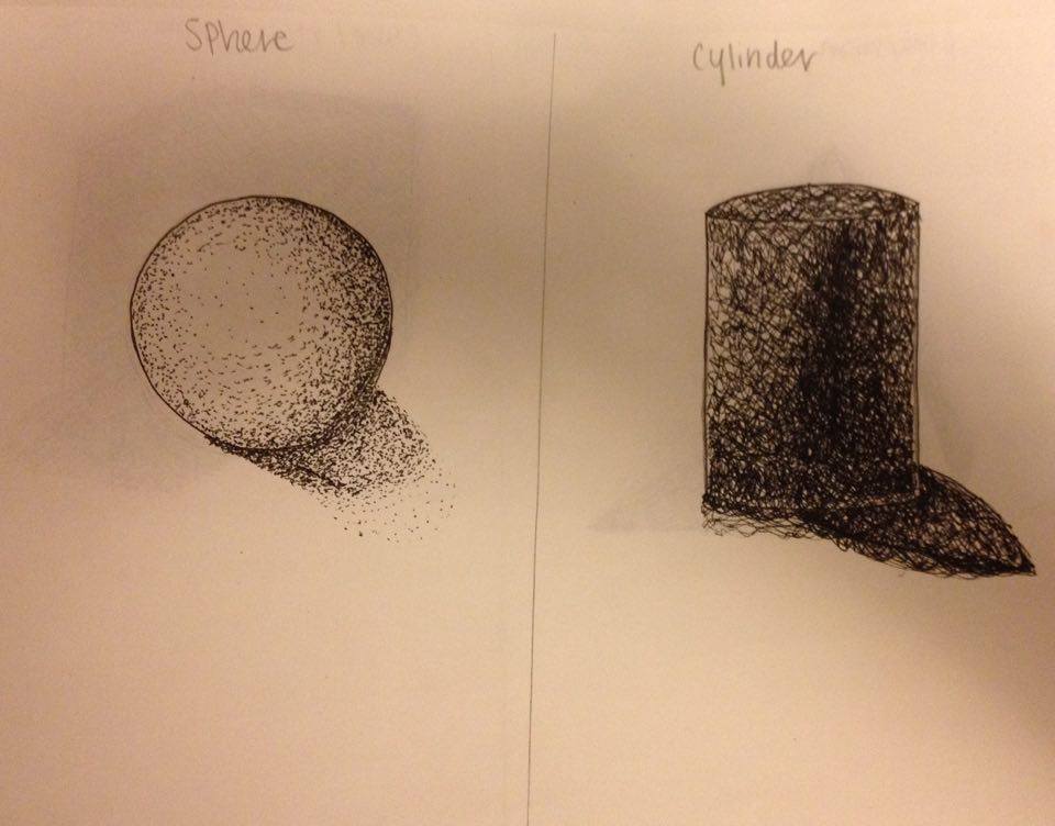
To practice the various pen and ink techniques, we were given four 3D objects to draw and shade using the pens. I had kind of a hard time with hatching and cross-hatching because I'm used to doing very sketchy lines, and for the hatching/cross-hatching technique to work, you have to control your lines, which is something I struggle with, but I think my cone looks pretty nice. I also had trouble making the shadows look natural and their shapes were hard to draw for some reason.
Pen & Ink Value Chart
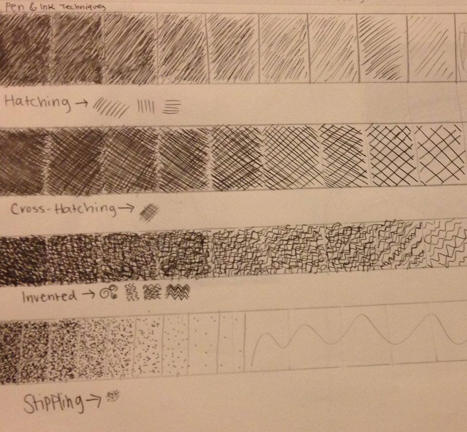
Since using a pen is much different from using a pencil, the processes of shading are a little bit different. To learn the techniques, we made four value charts featuring the gradient of values using each technique. The techniques I have the hardest time with are hatching and cross-hatching, because I'm not very good at keeping my lines controlled. I find stippling to be the technique I'm best with, even if I'm definitely no professional.
Perspective Drawings
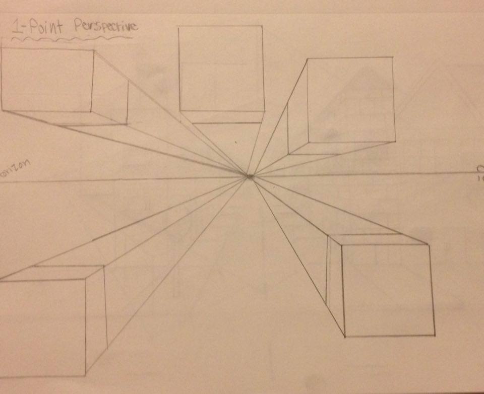
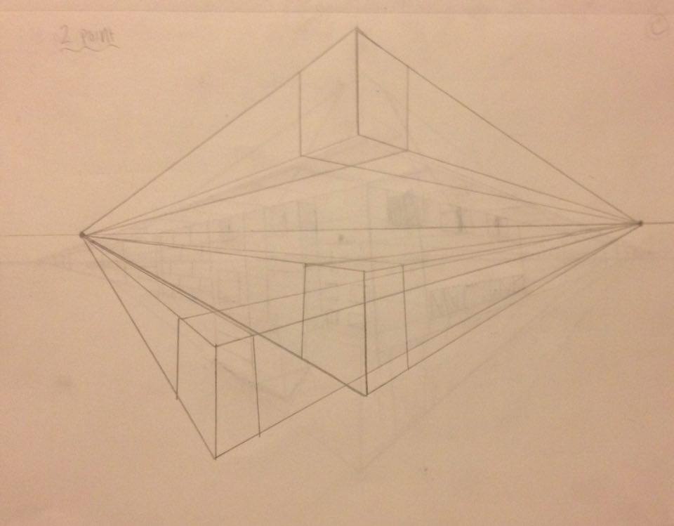
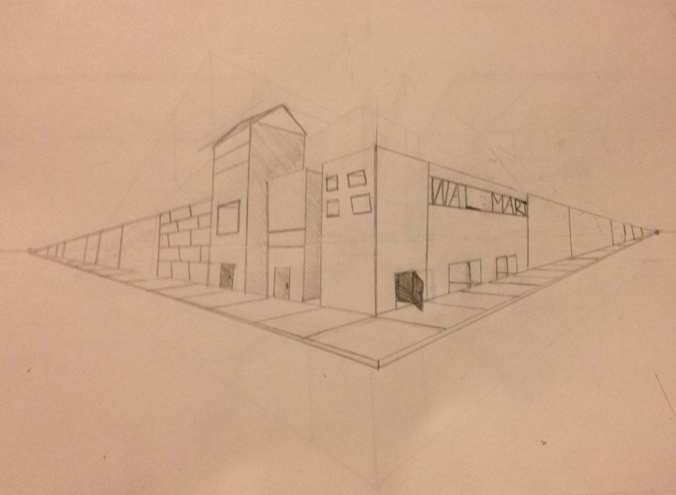
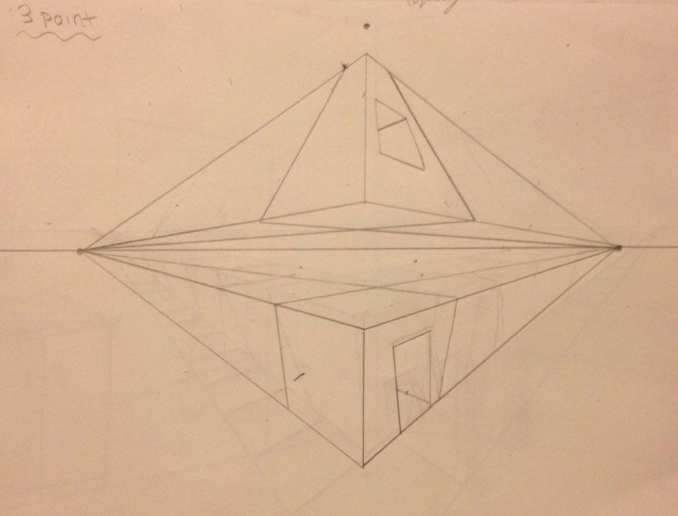
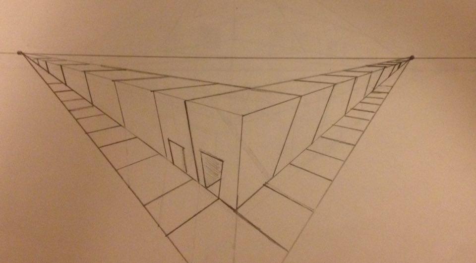
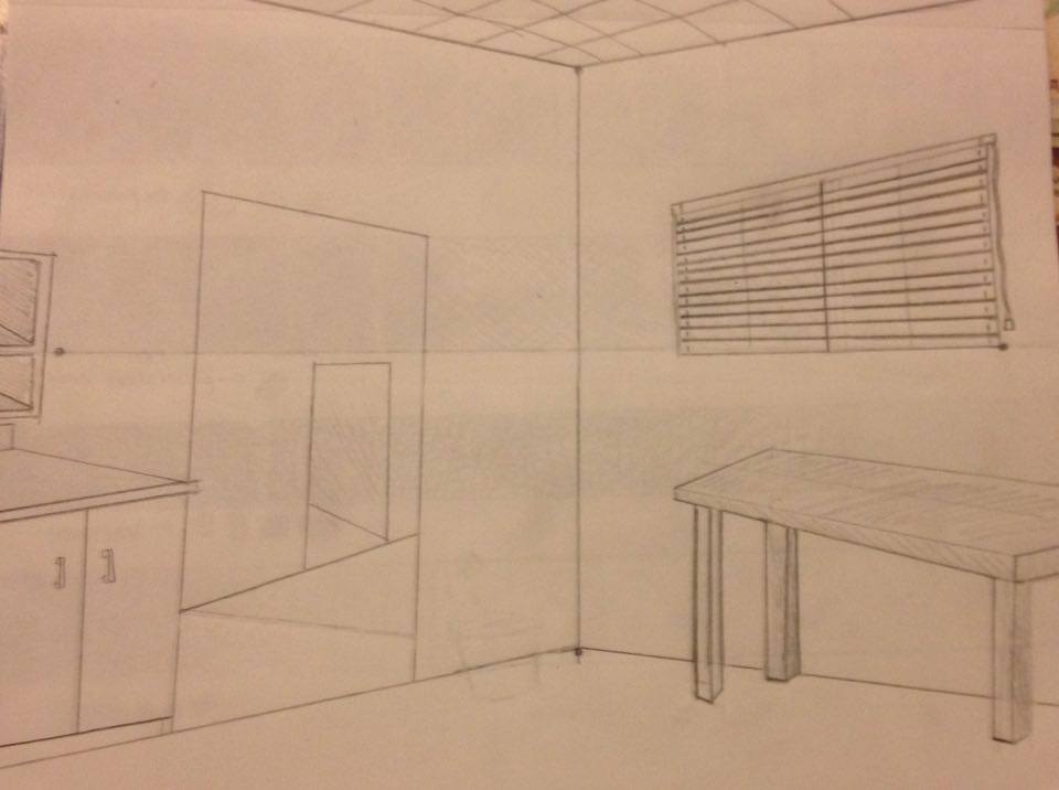
Featured in these photographs is my practice of first, second, and third point perspective in drawing. I did sketches of each perspective and then went on to create a street scene using those perspectives. I also have included a drawing of the corner of a room which used four points. I didn't have much of a technique regarding how I used my pencil. I simply took a ruler and drew a regular old line. I'd say my drawings are rather minimalist. I guess I didn't think much about the textures, it was purely just practicing methods of perspective. Value is very important to include when you use perspective in your artwork, and I believe that is because it really strengthens the depth of the piece. Since I didn't add much value to my drawings, the depth was shown by how the lines were drawn towards each vanishing point. Drawing the lines towards the points creates a realistic effect, as if you are really seeing how it would look to stand at this angle in a street. If I were to redo my drawings, I would probably add more detail and more value. Reading these questions has made me realize that I didn't do as much as I could have with these drawings. I suppose I didn't have much of an affinity towards what I was doing with these drawings, and that resulted in them being subpar. Thinking about it now, I think that as I grow as an artist, it is important to love what you are doing so that that love can be reflected in the piece.
Four Drawings
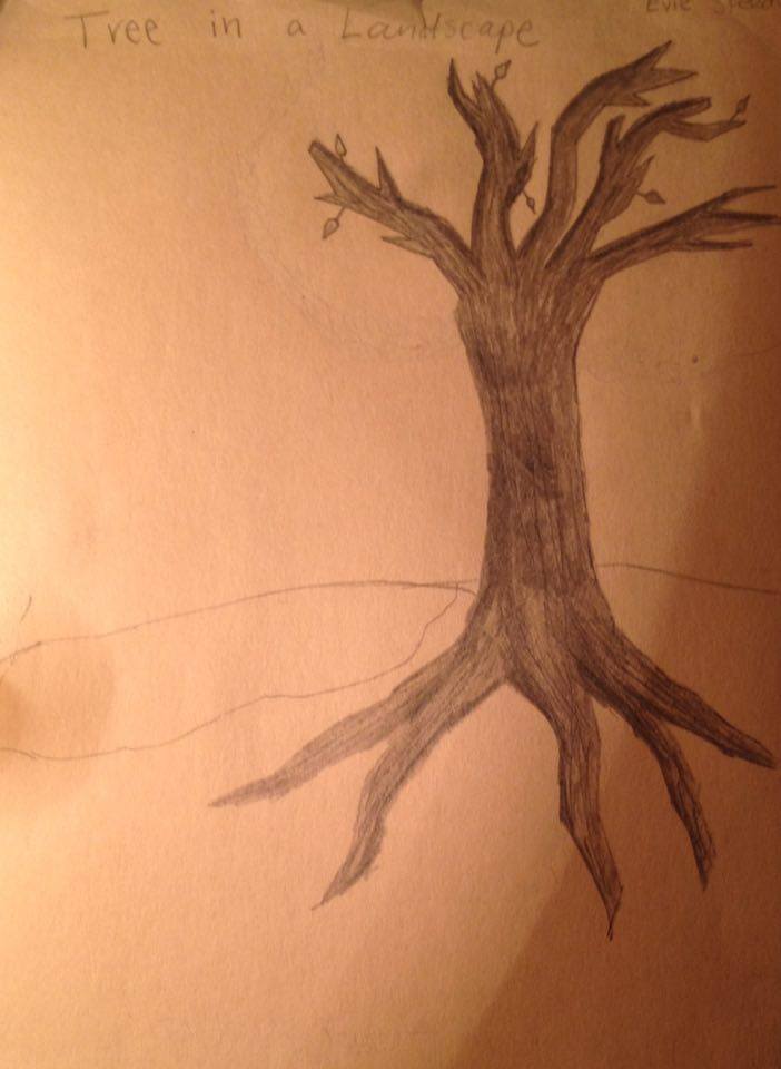
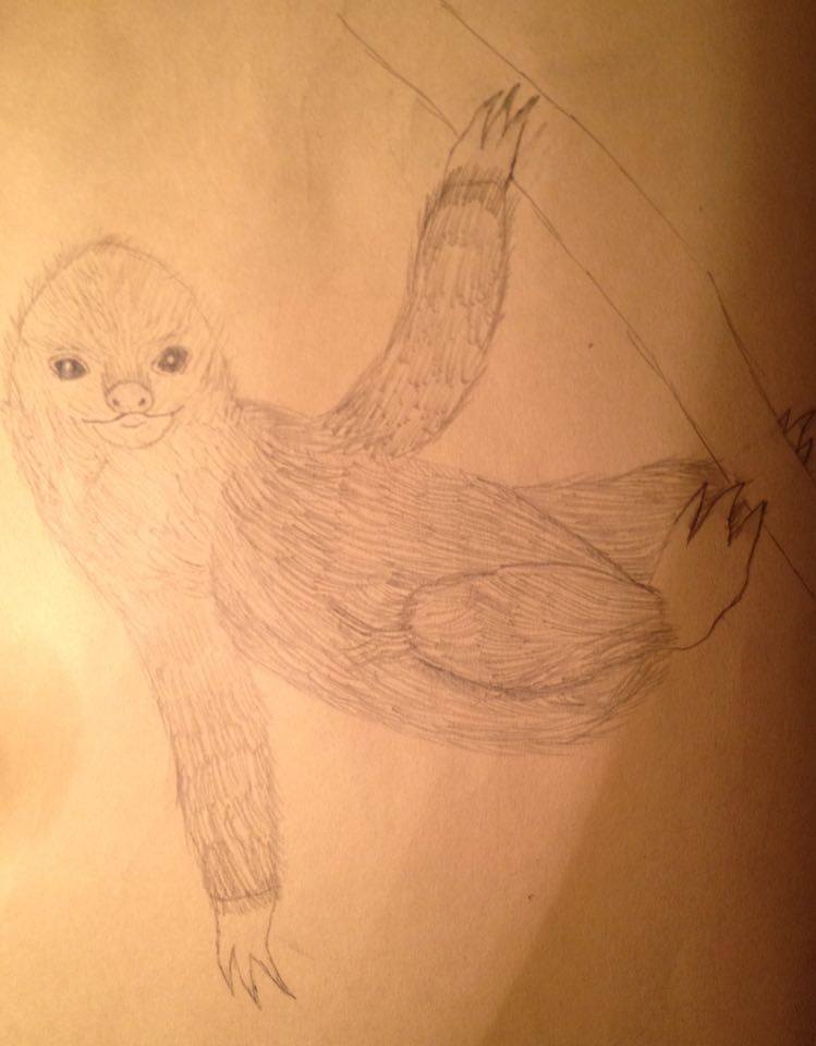
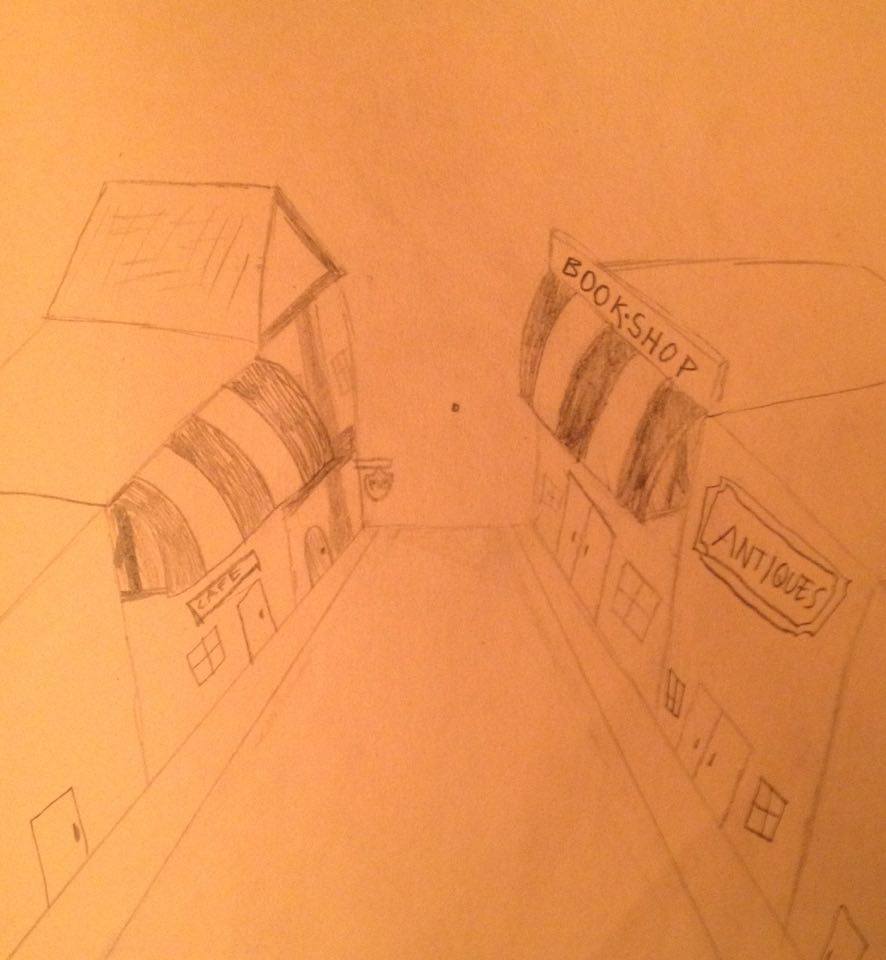
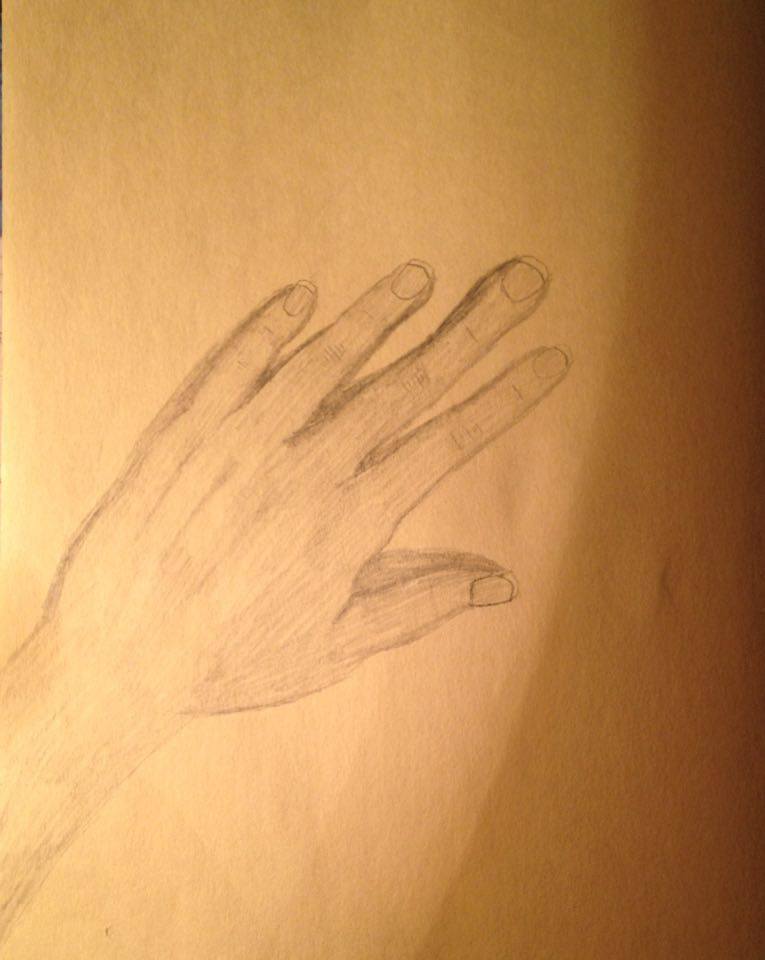
This was our first assignment. The first drawing is A Tree in a Landscape. To avoid having to draw all the leaves, I decided to draw a dead tree with a few leaves still clinging to the branches. I started off by drawing the basic shape: the trunk, the branches, and the roots. After that, I added in the lines on the tree to give it a rough texture and I also added a bit of shading. The second drawing was of an animal. I decided to draw a sloth, considering it is one of my favorite animals (and possibly my spirit animal). It really tested my ability to draw fur, and even though it was time consuming, I'm proud of how it came out. The third drawing is of a street in 1 pt. perspective. I had learned about 1 pt. perspective in Art 1, but unfortunately had forgotten how to do it, so it didn't turn out exactly right. And finally, the last drawing is of my hand. I drew it by simply looking at my hand and trying very hard to copy the shape, and then I shaded it and added shadows. This proved to be very challenging. Drawing from life is rather difficult for me, and hands are the hardest, in my opinion.
Still Life Final
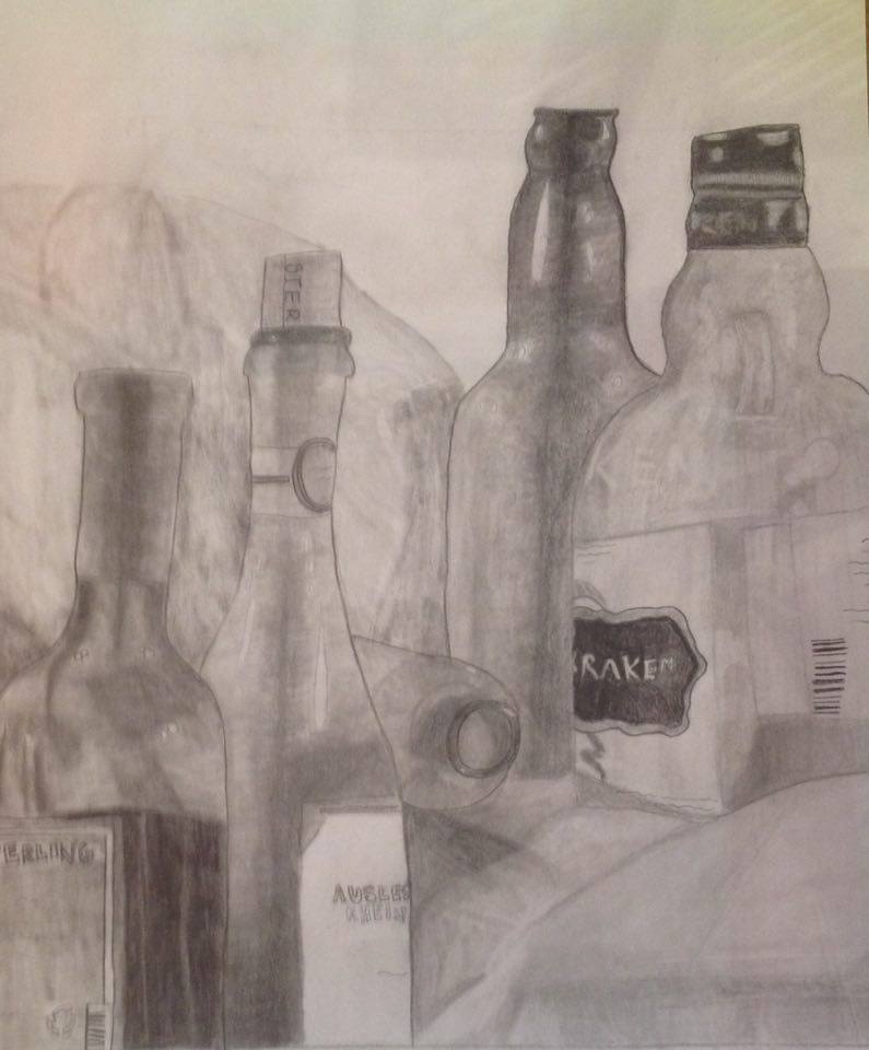
In this piece, I drew five bottles from life, and I incorporated the various shades and lights to create a realistic effect and give the piece depth. I began by sketching out different compositions from different angles to give me a few different options to choose from, and I settled on this composition. I also sketched a circle and added value to show the shadows and the light spots, and that gave me some practice which contributed to my final. A technique I used to blend was using a blending stump (which I feel was sort of cheating, but it's the way I am most comfortable with), and that created a smooth transition between the different values. The idea was to make the bottles look smooth, and, of course, glassy. I also had to try to make the fabric look wrinkled, which I found to be quite challenging, but I did the best that I could. I think if I were to redo my artwork, I would maybe try to challenge myself by not using a blending stump, and I would also try to make some of the lines a bit less wobbly. I would also redo how I added the light spots, because in my opinion, they look kind of unnatural. That was probably the hardest part for me. Overall, I am very proud of my work.
Still Life and Value Sketches
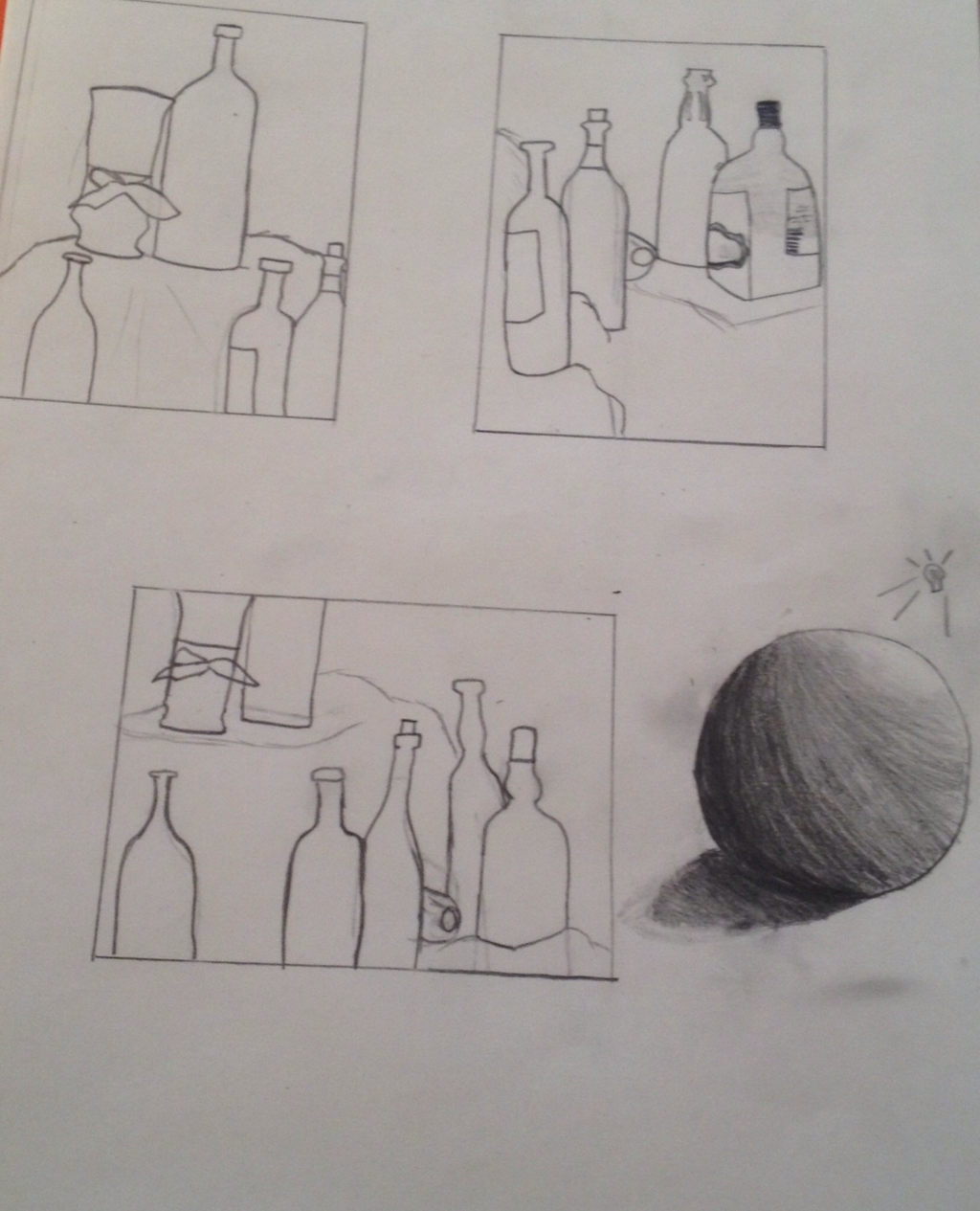
These are the three composition sketches I did for my still life drawing, and there is also a circle that I shaded to give it value and to make it look three-dimensional. As for my sketches, I chose the sketch on the top right for my final.
