Cinemagraphs
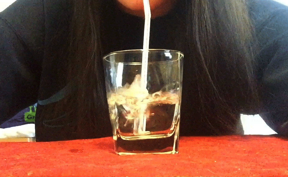
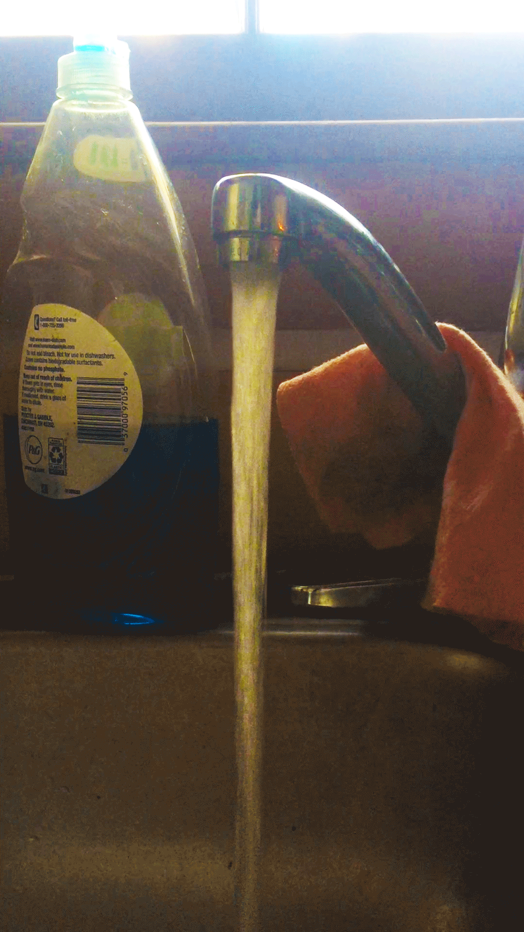
Well, this was a lot harder than I thought it would be. Mostly because my time management skills are horrific. My ideas were also harder to manifest than I thought they'd be. The first one is pretty much just me blowing bubbles into some water, which I think was a good idea, but it didn't turn out so well. The second one is water running from the tap. It was really difficult to keep the camera steady, and that makes my first cinemagraph look really shaky. I would definitely recommend using something to keep the camera from shaking.
Cinemagraph Ideas
So, since our next project is to make two cinemagraphs, I have come up with a few ideas of what I could do for them.
Making Tea
A lot of the examples of cinemagraphs I looked at had coffee in it or something. I drink tea like every day, so I thought I could do something where I show the sugar falling from the little packet into the mug or maybe pouring milk.
Petting My Cat
This idea would be a lot more difficult since it's hard to get animals to sit still, but it would basically be a still image of my cat's face while you see my hand petting her fur.
Blowing Bubbles Into A Drink
The movement in this one would come from the bubbles being blown with a straw.
Christmas Tree
I thought it'd be a cool idea to show me sitting near the Christmas Tree and then the lights just kinda turn on and off.
I'm not sure how well these ideas will work, but I'm hoping it'll all work out okay.
Package Design
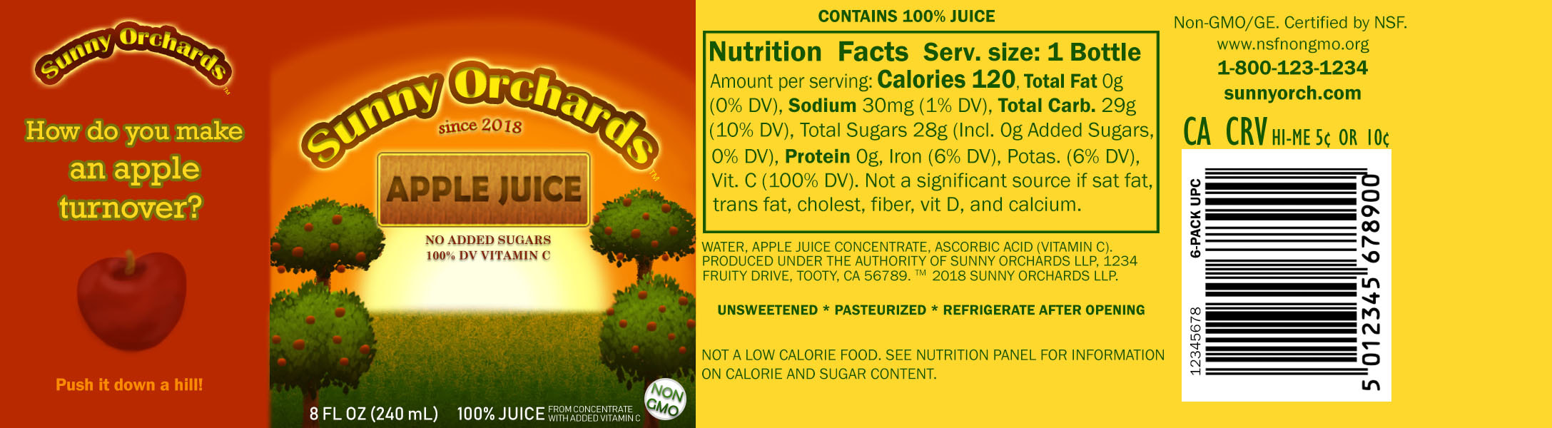
I decided to design a label for a bottle of apple juice. I did this because I've been having kind of an addiction to apple juice recently. I basically just used the actual label for reference, and the first step I had to do was design a logo for the company. After that I just added small details and tried my best at drawing the little orchard scene. Then I pretty much just copied what was on the label for the nutrition facts and such. I wasn't sure what to add on the very left part, but it suddenly came to me to have a little apple joke. I think the most successful part of my piece is probably just that I think it really does look like a realistic label overall. It's certainly not perfect, but I'm quite proud of it. If I were to change anything it would probably just be to make the trees look more realistic.
Historical Photos
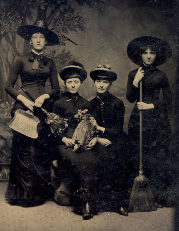
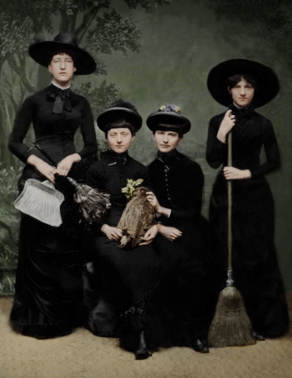
Here I've taken an old photo of four young ladies from what I'm guessing is the Victorian Era. Most online sources say these women were witches, so I thought it'd be appropriate for me to restore/colorize this photo since I'm very interested in witchcraft. I had a lot of fun getting rid of all the scratches and stuff. It took a long time, but it was really cool seeing the progress I was making and how different it looked when I was finished. Overall I found this project to be kind of easy, but the biggest struggle was fixing up the right side of the photo because of all the smudginess. As for colorizing, I thought it was really fun bringing the women to life. When you look at old photos it's a little hard to imagine that they were real people, since it's in black and white, but when you add color you feel more connected to them. It makes me wonder what these ladies were like and if perhaps they really were witches (real ones, obviously, not the fantasy-type). If I were to add or change anything I would maybe try to work on making the lighting on their clothes look more realistic. Some parts of their clothes were so covered up that I couldn't figure out where the raised fabric was, so it doesn't look perfect, but I'm proud of what I did.
Edible Architecture
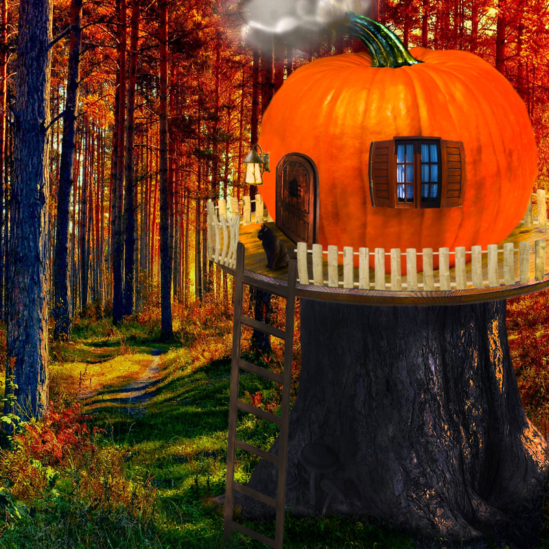
I could see a young witch living in this house. I thought I'd use a pumpkin since it's the season for them, and I tried using elements that would make it look kind of witchy, such as the black cat, the medieval-looking door, and the light. I had to do a lot of alterations to the coloring/lighting to make this look realistic. That was surprisingly more difficult than I thought it would be. It definitely doesn't look completely realistic, but I tried my best. If I had to change something it would definitely be the lighting. I need to learn more about making things look realistic.
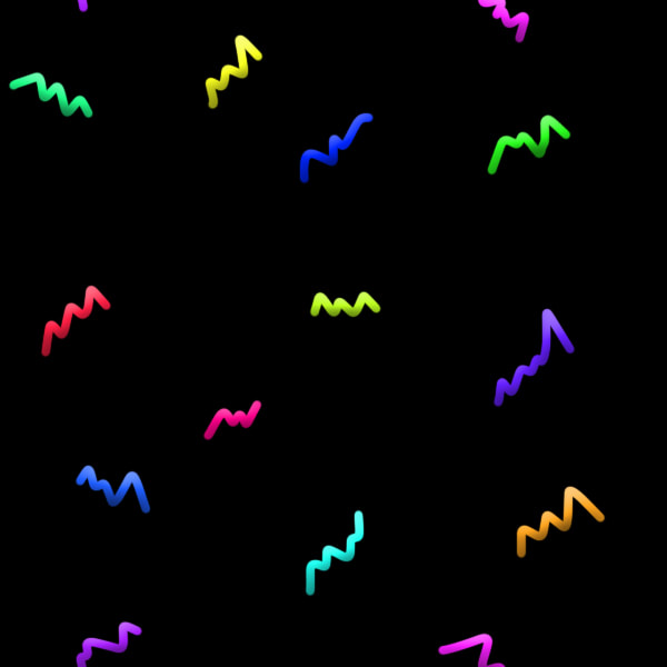
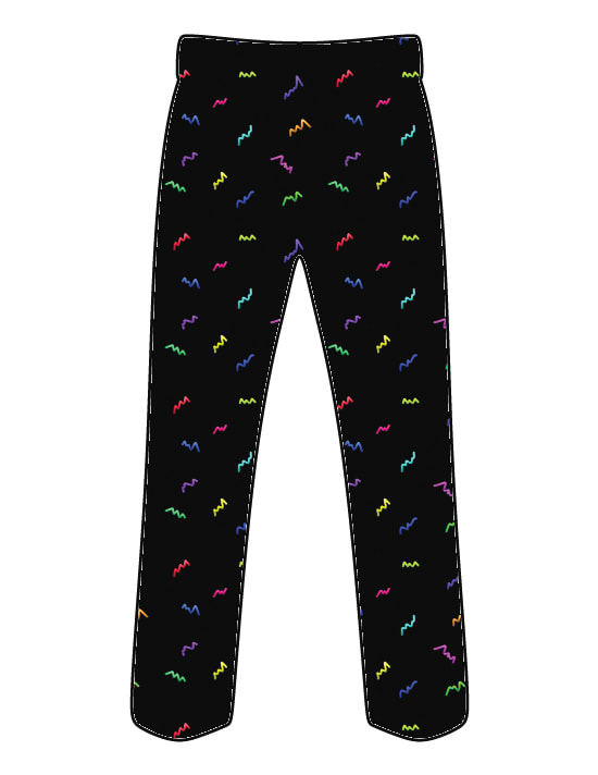
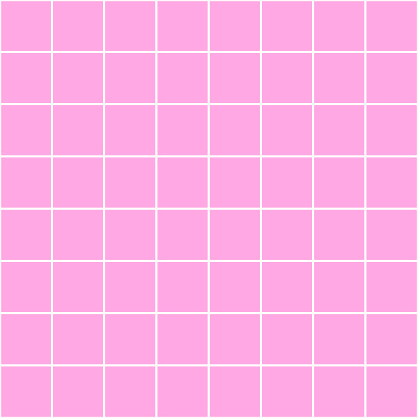
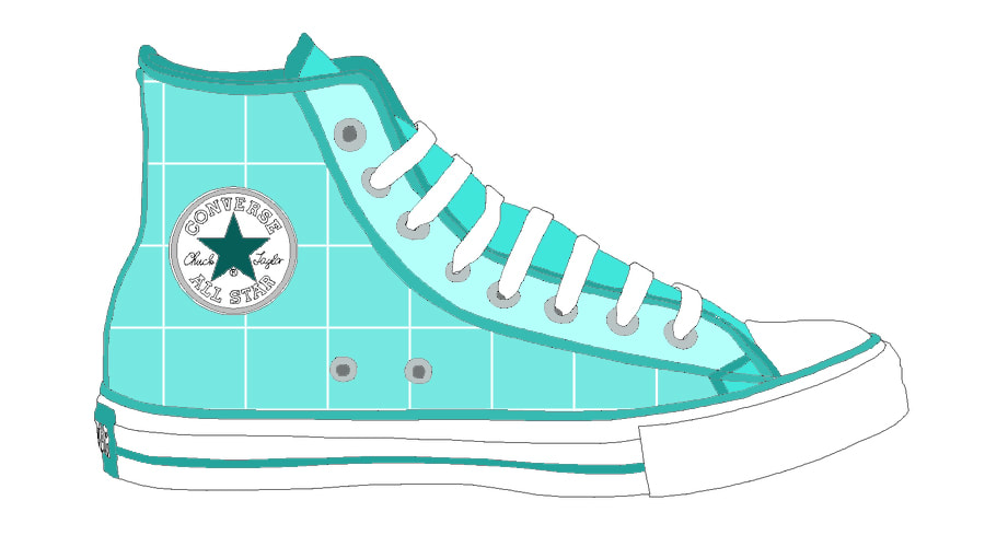
Surface Patterns
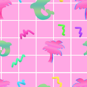
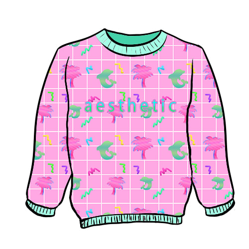
Showstopper Pattern
Sideshow Pattern #1
Sideshow Pattern #2
The theme of my designs is sort of like Vaporwave, which is a genre of music that has become kind of a meme. It focuses a lot on "aesthetic" and things that evoke nostalgia and deep emotions. I was struggling to come up with an idea, and then I thought about how I really enjoy listening to Vaporwave music and how the aesthetic is pleasing to look at. Since Vaporwave is such a popular thing now, I thought it'd make a good pattern. Of my three patterns, I definitely like the Showstopper the best, and I would love to wear that sweater. I like this one the most because I think all the elements work really nicely together. Something I had a hard time with while working on this project was the grid pattern. I had to redo it so many times to get it to look normal when it repeated. If I had to recommend something to someone else who is working on this project it'd be to make sure you have a good palette of colors that work together, and to also not be too hasty and make sure things look good before you save your progress, because I had to redo everything many times. All in all, this was a very enjoyable project and I learned a lot of new things.
State Fair Poster
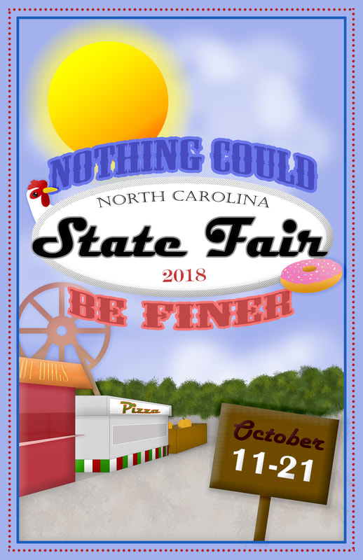
The North Carolina State Fair has a graphic design competition, and this year they wanted us to make a poster advertising the fair. My idea was to try and make it look sort of vintage (which ended up evolving into whatever it is I have now). The thing I definitely struggled with was figuring out what illustrations I should put on the poster and how I should arrange it to look creative. I didn't get enough time to get it completely how I wanted it, but I'm proud of it anyways. If I were to add/change anything about it I'd definitely want to make the drawings look more detailed, and I'd want to eliminate the empty space on the bottom left.
NewAnimal + Frog Tongue
This week we worked on creating a new species by combining two or more animals into one magnificent creature.
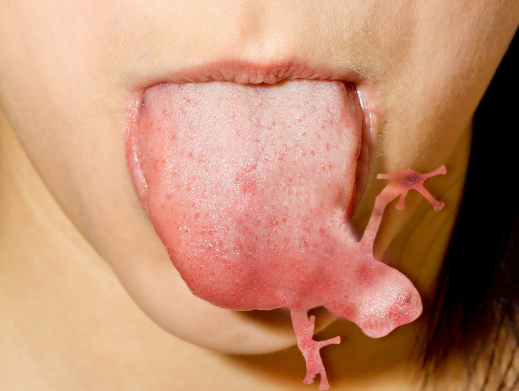
Before working on the main project, we were introduced to the cloning tool by creating deformed tongues with frogs sticking out of them. The cloning tool basically just takes part of one picture and allows you to paint the color/texture onto another picture. This was used to make it look like the tongue sort of starts to form the shape of a frog. One friend told me mine kind of looks like a frog is inside the tongue trying to escape. Something I don't really like about my tongue piece is how sharp the edges of the frog look.
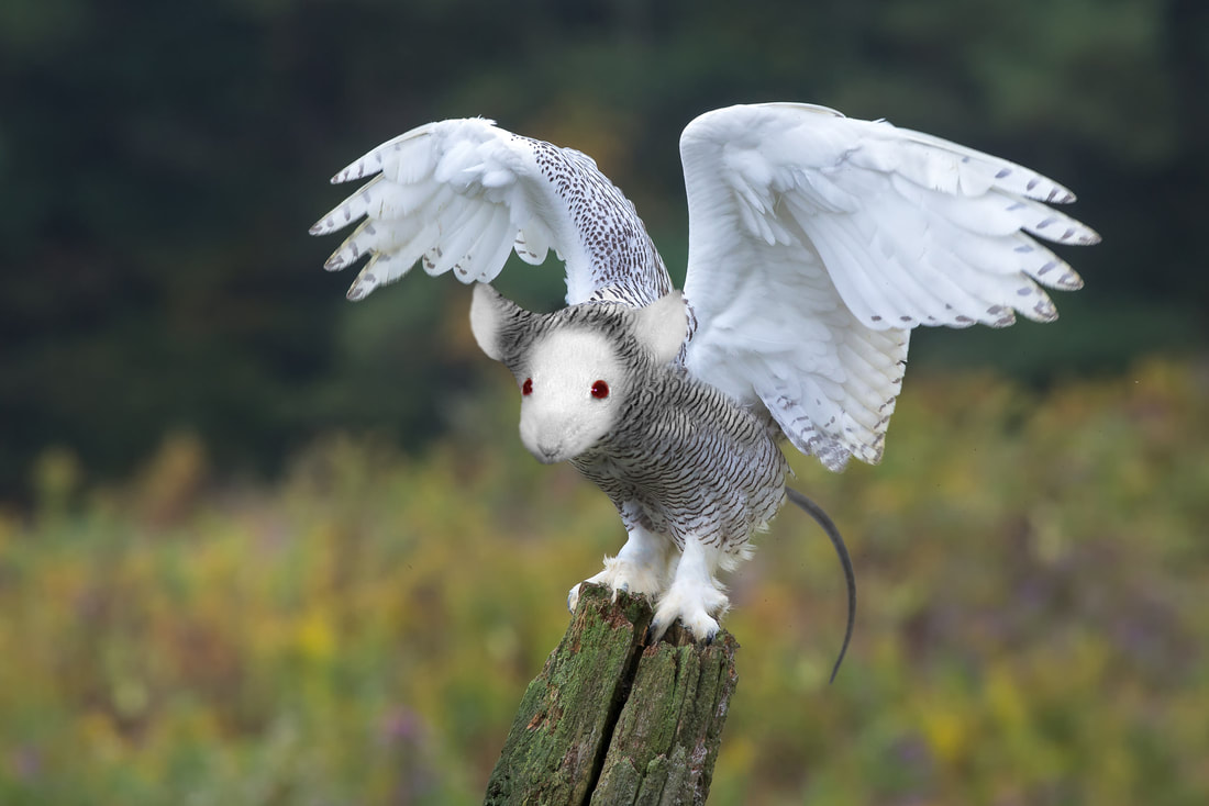
After finishing that, I began to work on my Newanimal. I decided to combine an owl with a white mouse because I thought it was ironic, since owls eat mice. I gave it the name "Rodent's Revenge" because I imagine this creature eats baby owls and other smaller-sized owls to avenge the mice eaten by owls ((it is a very feared creature among the owl community)). A problem I had with this project was finding two images that really worked together. I also had a hard time making the mouse's head really look like it was naturally a part of the owl's body. That's probably something I would try to work on because I'm still not totally satisfied with how it looks, but I am still proud of it.
Before working on the main project, we were introduced to the cloning tool by creating deformed tongues with frogs sticking out of them. The cloning tool basically just takes part of one picture and allows you to paint the color/texture onto another picture. This was used to make it look like the tongue sort of starts to form the shape of a frog. One friend told me mine kind of looks like a frog is inside the tongue trying to escape. Something I don't really like about my tongue piece is how sharp the edges of the frog look.
After finishing that, I began to work on my Newanimal. I decided to combine an owl with a white mouse because I thought it was ironic, since owls eat mice. I gave it the name "Rodent's Revenge" because I imagine this creature eats baby owls and other smaller-sized owls to avenge the mice eaten by owls ((it is a very feared creature among the owl community)). A problem I had with this project was finding two images that really worked together. I also had a hard time making the mouse's head really look like it was naturally a part of the owl's body. That's probably something I would try to work on because I'm still not totally satisfied with how it looks, but I am still proud of it.
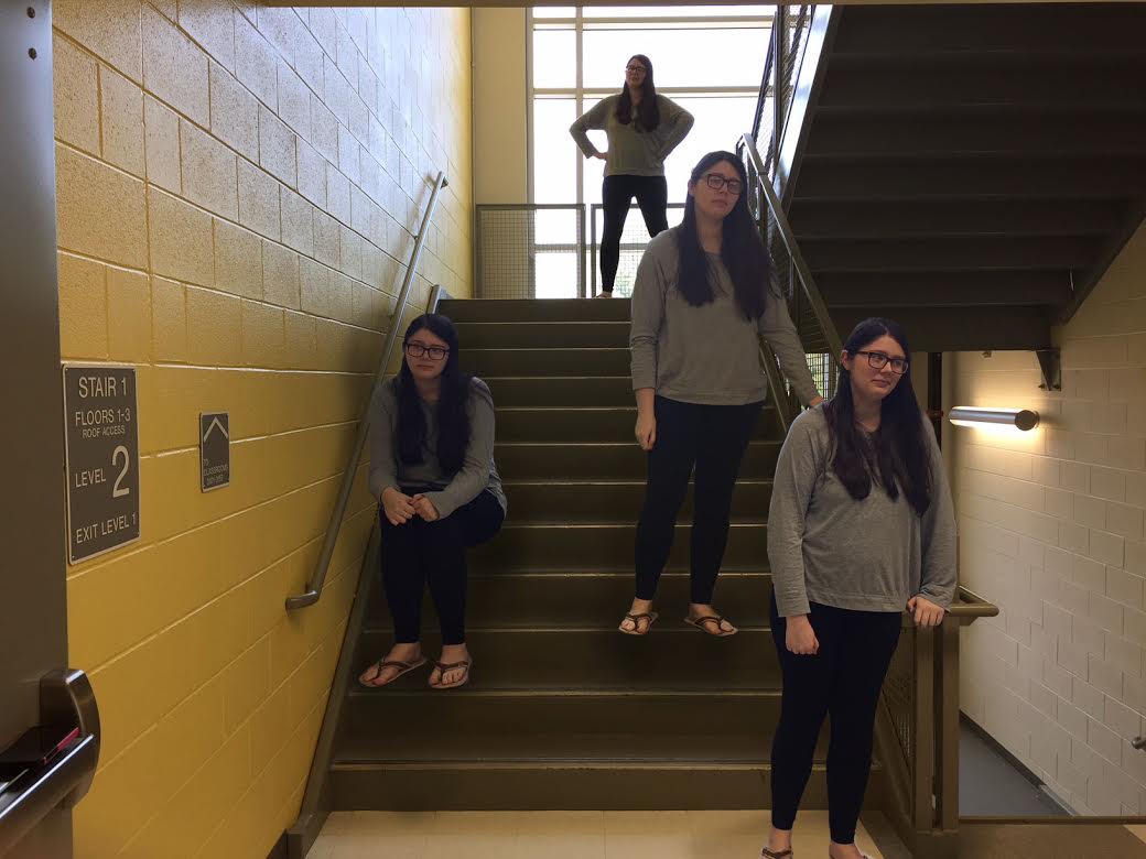
Clones of MYself
Never did I think I would see four of me in one picture, but thanks to Photoshop, it's finally happened! This was surprisingly a lot easier than I thought it would be. I know it isn't perfect, but it was my first cloning project, and I'm quite proud of myself nonetheless. I learned about "masking" which is hiding portions of one layer and revealing the other. This technique was used to make parts of the different pictures look like they're part of the background layer. Of course I did encounter a couple problems during this process. One of which was the fact that the camera wasn't totally in the same position for each picture, but I lined everything up using the Transform tool and by moving the layers around a bit. There was also the issue of there not being shadows in places there should have been, which made it look like I was sort of just floating there. I tried my best to add shadow using the Burn tool, but I'm not sure how realistic it looks. Something I'd probably change about my project is making the lighting of each layer all look the same. The camera must have changed focus while we were taking pictures, therefore changing the lighting, so one of my pictures looks a little off. I would also want to learn more about making more realistic shadows.
